SuiteCommerce, SuiteCommerce MyAccount and SuiteCommerce Advanced 2020.2+: Develop Your First Extension
Caution: this content was last updated over 3 years ago
This tutorial is written for SuiteCommerce, SuiteCommerce MyAccount, and SuiteCommerce Advanced (SCA) 2020.2 and newer. As it uses modules introduced in 2020.2, it is not appropriate for older versions of SCA.
If you are learning to develop on SuiteCommerce, SuiteCommerce MyAccount, or SuiteCommerce Advanced 2020.2 or newer, this tutorial will take you through the steps of creating an advanced extension.
In particular, we will cover:
- Working with the extension developer tools
- The architecture of a SuiteCommerce site and how extensions can introduce new functionality
- Key concepts such as the extension framework, views, models, collections, page types, etc
- The separation of the frontend and backend, and sending requests and receiving responses
- Performing CRUD (create, read, update and delete) actions on data in NetSuite with services and SuiteScript
- Configuring a website
- Using built-in, reusable UI functionality
- Templating with Handlebars
- Styling with Sass
We will go over all of this using an example business requirement as the basis. I will walk through how I would implement this functionality, discussing topics as we go.
This tutorial will be broken down into multiple parts roughly along the lines of:
- Understanding the basics of a module, and getting an extension to return “hello world” as a log in the developer console
- Converting the basic starting point into a working frontend, so that we can visit a URL and see it in a page
- Connecting the frontend to the backend, so that we can request data and have it return dummy data
- Setting up the backend with records, and enabling the full array of CRUD operations
- Styling the extension to improve the user experience and ensuring a consistent look-and-feel with the rest of the site
As we’re doing a tutorial, you should be working in some sort of safe testing environment, such as a sandbox.
Also note that the process of creating a new extension is documented, and you should familiarize yourself with the documentation (this tutorial simply goes through it in more depth, offering examples).
Finally, as with all code samples on this site, it is merely an example. There is no guarantee that it is production ready or that it meets any particular set of requirements. It is included for educational purposes only.
Part 0: The Business Case and Approach
In this tutorial, we are assuming the role of a developer who has been hired by a company that has a SuiteCommerce web store. They have asked us to implement new functionality to their website.
The functionality must capture the user preferences of each of their users. For simplicity sake, we’re going to use color and size. Furthermore, we want this to be self-service; that is, we want the users to be able to enter this information themselves.
We know that if we are dealing with the data of individual users we need to make this accessible through a secure part of the website only available once the user has logged in. This means we will be adding the functionality to the My Account part of the site.
We will introduce a new extension that adds a link to the side navigation, which takes a user to a list of their saved preferences. They can then fill out a form to create and save a new preference, or review, edit or delete their existing ones.
This will be achieved by creating a custom record in the NetSuite application and then using SuiteScript to manipulate the records. Commands will be sent from the frontend of the website via AJAX calls to the backend SuiteScript via service files.
Finally, we must make sure that there a is a consistent look-and-feel with the rest of the site and that we are offering a positive user experience, so we will style the new pages that the functionality introduces as well as make use of common UI features.
Part 1: Prepare Local Files, Create a Baseline Extension, and Log “Hello World!” to the Console
By now, you should have already set up everything you need to get started. That includes, for example, the extension developer tools – if you haven’t already, you’ll need to do that first.
Open a command line interface, and change directory to where your extension developer tools are located. You’ll also need to open your preferred code editor to the same location.
Now, one of the commands we include with the extension developer tools is a command to generate a skeleton of an extension. It’s really cool because it has options for the types of files you could include and then builds the module appropriately. For reference, this is:
gulp extension:create
However, I’m going to suggest that we don’t use it in this tutorial.
The reasons for this are quite simple: I want to take you through the process, step-by-step, of building up a module, and I want to introduce you to the component parts as we need to do.
Instead, we will create all the folders and files manually, giving us time and space to look at some of the nuances.
To begin development, we need to make sure we have a copy of the site’s theme as well as any existing custom extensions. In your CLI, run:
gulp extension:fetch
Login and select your site; when you complete the wizard, all relevant files will be downloaded locally to your machine.
Create the Folder Structure
When working with extensions, all extension code needs to live in the Workspace directory. By default, it will contain folders for all existing extensions on the site you has well as an Extras folders, which will contain, among other things, a copy of your site’s theme. Note that this theme is just a copy — changing any files may affect your local version, but it will not be uploaded (so you could use it to experiment and test, but permanent changes should be made using the theme developer tools).
In your Workspace directory, create a folder structure like this:
Workspace
└── Example
    ├── assets
    └── Modules
        └── UserPreferences
            ├── JavaScript
            ├── Sass
            ├── SuiteScript2
            └── Templates
When creating your own extension later, it is important to note that folder names such as JavaScript and Sass must be used exactly. Names like Example and UserPreferences are specific to this extension, and can be customized.
Add an Entry Point JavaScript File
A crucial file in any extension with JavaScript is the entry point file. When an extension is called to load into the site’s application, it is this file that is called.
When creating any file in your extension, it’s important to employ good namespacing rules. Typically, there are two places you will name a module:
- Its filename
- Within the file itself
These should be identical, with the file extension excluded when naming the file within the file itself.
Typically, you would do something like this: [vendor name].[module name].[purpose] — we’ll see more examples of this later on.
In the JavaScript folder, create Example.UserPreferences.js and in it put the following code:
define('Example.UserPreferences', [

], function (

) {
    'use strict';

    return {
        mountToApp: function (container) {
            console.log('Hello World! UserPreferences calling!');
        }
    }
});
Asynchronous Module Definition (AMD)
So, we start with a define statement. Every JavaScript-based file in extension, must be created as a module and for that we are using asynchronous module definition (AMD). And for that, we are relying on two libraries: RequireJS and almond.
I won’t go into too much detail, but using AMD means that our code:
- Performs faster, as we only load modules that we need (and they are loaded separately)
- Is less likely to error, as we can specify which dependencies must be in place before other code can run
- Is neatly segmented into modules, so that it is more logically organized and easier to work with
When we define a module, we are specifying three things:
- What the module is named (almond requires all modules to have names), which means that it can be called by other modules
- What modules this module depends on (passed in as an array of names as strings), and then named in the following callback’s parameters
- What code is returned when the module is called (ie its callback)
In our starting entry point file, we have named the module the same as the file, following the standard practice.
We then have defined no dependencies.
Finally, we pass in a callback as the returned code; as there are no dependencies, we have not named them.
Within the callback, we have specified that we are going to use strict mode, which means that we are going to use a stricter subset of JavaScript. You can read more about this yourself, but, in short, it means that we are going to use higher standards when coding as this will help minimize any potential problems down the line.
We then return an object. The returned object is effectively the ‘meat’ of the module. We will define properties of this object, that will act as the module’s methods. You are generally free to determine the names of the properties yourself, but there are a few expected/reserved names.
One such expected method is mountToApp. As the name suggests, this is called when the entry point is first loaded and ‘mounted to the application’. It is within this method that you will then call on other aspects of your extension.
Note the container parameter. Whenever an entry point file’s mountToApp is called, it is always passed in a ‘container’ object. This object is a representation of the application that is calling it. It will have access to a number of useful objects, methods, properties; crucially for us, it will also provide access to the extensibility API.
For now, however, we’re just going to tell it to log a message to the console, so that when the application loads it, we know that has succeeded in this basic task.
Add an Extension Manifest
Now that we have a super-basic extension, we can actually take the steps to test it. But, before we can do that, we will need to add a manifest file to our extension.
A manifest file contains a map of the structure of our extension, as well as important metadata about it what it does and what versions and products it is compatible with.
If you use the command to auto-generate an extension, a manifest will be included automatically, but as we’re doing things manually, we will have to do it manually. We can, however, start with a skeleton.
In Workspace/Extension, create manifest.json and in it put:
{
    "name": "Example",
    "fantasyName": "User Preferences Manager",
    "vendor": "ExampleVendor",
    "version": "1.0.0",
    "type": "extension",
    "target": "SCA,SCS",
    "target_version": {
        "SCA": ">=20.2.0",
        "SCS": ">=20.2.0"
    },
    "description": "An example extension to demonstrate SuiteCommerce customizations",
    "skins": [],
    "assets": {
        "img": {
            "files": []
        },
        "fonts": {
            "files": []
        }
    },
    "javascript": {
        "entry_points": {
            "myaccount": "Modules/UserPreferences/JavaScript/Example.UserPreferences.js"
        },
        "application": {
            "myaccount": {
                "files": [
                    "Modules/UserPreferences/JavaScript/Example.UserPreferences.js"
                ]
            }
        }
    },
    "local_folder": "Workspace\\Example"
}
There’s a lot going on here. We won’t, however, being going into too much detail about it here as we have documentation on this and it doesn’t make sense to duplicate it.
What I will say is that this is a bit of a pared-down manifest, and there’s space for a lot of different files in here — but we’ll get to those later. I would also add that the target_version field is particularly important: we’ve designated a minimum version, and any site that is not running 20.2.0 or newer (ie >=20.2.0). Extensions not compatible with a site’s version will not be shown in the list of available extensions (so if that happens to you, check the versioning data in the extension).
Also note that in many cases, the developer tools will automatically update the manifest when files are added, deleted or changed — but some cases requires us to edit it manually.
Test on a Local Server
We are now in a position to see if the extension will load and if we can print its greeting to the developer console.
As with the information on the manifest file, we have extensive documentation on how to test an extension on a local server and so I won’t retread that ground too much.
In your CLI, run gulp extension:local.
This command starts a local server; it is important for extension development as it lets you test out changes to frontend files in real-time without having to deploy them to NetSuite or activating them on an actual site. Instead, it tells the application to load some of the site’s files and resources from your computer, rather than those stored in your NetSuite account.
When the process completes, you will need to navigate to the ‘local version’ of your site in your web browser. In order to construct the correct URL, you will need to knew some details about your site, such as your domain name, account ID, and what SSP application you are using.
Again, refer to the documentation for specifics, but here are some examples:
// Assuming www.example.com is the domain
// Assuming 12345 is the account ID
// Assuming the site is running SCA 20.2

https://www.example.com/c.123456/sca-dev-2020-2/shopping-local.ssp

// Assuming the site is running SuiteCommerce

https://www.example.com/c.123456/scs/shopping-local.ssp

// Sometimes you don't need to include the account ID

https://www.example.com/sca-dev-2020-2/shopping-local.ssp
If all goes well, your site will load and you will see your site load. However, since we are in the shopping application part of the site, we will not see the console message (remember in the manifest, we only specified a myaccount entry point?). Therefore, we will need to go the My Account part of the site.
Click on the Login link to your site and proceed to log in to a dummy account. Note how when you traverse a site’s touchpoint (ie change applications) the URL changes and reverts back to its ‘live version’, ie, the -local part of the SSP’s name will be removed from the URL. Continue logging in and then head over to My Account. When you’re there, add the -local part back to the URL. The page will reload and you should now be in the local version of your site.
Now, if you open up your browser’s developer tools, you should see a message in the console:

Deploy the Extension
At a very basic level, we know that the extension is operational — so let’s test it on a live site!
In order to do this, we need to do two things:
- Deploy the extension code to the NetSuite account that runs the web store
- Activate the extension, so that the site knows to run the extension code
First, you will need kill the local server process (this is usually CTRL+C or CMD+C). Then, run the following command:
gulp extension:deploy
This will begin a process of building the extension code for deployment (you will see a lot of tasks starting and finishing in the log). When it finishes, you will need to do a number of things, such as which extension you want to deploy, provide login details for the account, and selecting which account and site to deploy to. You will be asked to confirm the supplied metadata in the manifest; for example, it will ask you to provide the vendor name but you can just press Enter if the value in the parenthesis is correct.
Some important things about this:
- The login you use should be one that uses the SCDeployer role — this is a specific role type in NetSuite that has all the roles and permissions for deploying and activating code on a NetSuite account. If you try to use other kinds of roles (including administrator accounts) you may get errors when deploying. For more information, see Developer Tools Roles and Permissions.
- When testing an extension (or doing a tutorial like this) it is best to use a site and/or account that is a sandbox or test drive account. You wouldn’t want to disrupt a customer-facing site with some test code 😊.
When the job finishes the code will have been copied up to the file cabinet on your account — but now you must activate it.
Activate the Extension
To do this, you will need to log in to your NetSuite account in your web browser. When you’re in:
- Go to Commerce > Extensions > Extension Manager
- Click New Activation
- Select the appropriate web site and domain
- Click on the Extensions tab
On this tab, all available extensions will be shown. Any currently active extensions (ie, already activated) on the site will be ticked. You should see your new extension show up — if you don’t, the most common reason is a version mismatch (ie your site does not meet the version requirements in the extension’s manifest).
Select your new test extension by clicking the Active checkbox in the row for the extension and then click Activate.
When you’re redirected back to the Extension Manager page, your site’s Status will change to pending. Feel free to periodically refresh the page to get updates about the progress of the activation process.
Activation can take a variable amount of time. Sometimes it can be as short as a minute, and sometimes 10 or 15. Things that can affect the performance of activation:
- The number of extensions you are activating
- The complexity of the extensions
- The number of SuiteCloud Plus processors available on your account
- The current load of those SuiteCloud Processors (eg if other map/reduce scripts are running)
- The type of environment (eg sandboxes are often less performant than production accounts)
If it takes longer than 15 minutes, this may indicate a problem either with your extension or account. Very long running activation processes will eventually time out, and you will be shown an error message indicating this if it happens. If this happens, try activating again — if the problem persists, open a case with NetSuite support.
As soon as activation is complete, the extension will be live and available on your site. Repeat the testing steps to see it in action (although, this time, you won’t need to change the URL and point to a local SSP!).
Part 2: Prepare Page Types, Baseline Views and Templates, and Show “Hello World!” in the Page
At the moment, the extension is printing a message into the developer console, but we know that we need to start making progress towards implementing the functionality the users will expect.
In this part, we’re going to look at adding a new URL route to the application — so users can visit a page — and a view and template, so that we have a page to show them.
Add a New Page Type
I won’t go into a lot of detail about this, as we have an entire page elsewhere on page types and page layouts, but I will give a summary and go over what you need to know.
When you specify a page type, you are telling the application that there is a particular class of pages that follow the same sort of rules. This becomes particularly useful when dealing with things that are used multiple times; for example, we declare product detail pages (PDPs) as page types because they typically take the same kind of data (ie product data). We also know that PDPs have a similar URL structure, and that they typically present their data in the same sort of way.
Another way to look at page types is when you want to present a page in a certain way. After defining a page type, you can then provide additional templates (aka layouts) and then a business user can use site management tools (SMTs) to choose which layout they want to use in different scenarios.
A final, interesting aspect of page types is that they can also be set up to be ‘CMS-creatable’, which means that, through the SMTs, a business user can create new instances of those pages. These are great for pages that act as static content or landing pages (such as for FAQs). However, our functionality doesn’t need to do that so we’re not going to worry about that.
That aside, all we need to know is that when we want to create a new URL route at the code-level, we need to use a page type (even if we don’t intend to use all of the other bit of functionality these offer).
In our example, we’re going to want users to be able to visit the following paths:
- /preferences — a landing page that lists all of a user’s preferences
- /preferences/add — a page where a user can add a new preference
- /preferences/:id — a page that lists the details of a specific preference (and also enables them to edit them!)
To do this, resume editing Example.UserPreferences.js and replace it with the following:
define('Example.UserPreferences', [
    'Example.UserPreferences.List.View'
], function (
    ExampleUserPreferencesListView
) {
    'use strict';

    return {
        mountToApp: function (container) {
            var PageType = container.getComponent('PageType');

            PageType.registerPageType({
                name: 'example_userpreferences_list',
                routes: ['preferences'],
                view: ExampleUserPreferencesListView,
                defaultTemplate: {
                    name: 'example_userpreferences_list.tpl',
                    displayName: 'User Preferences List'
                }
            });
        }
    }
});
Now, the first thing you’ll note is that we have added a dependency to our module: a list view. This list view doesn’t exist yet (we’ll create it in a moment) but we need it here because when we create a new page type, we need to give it a JavaScript module to call when we want to show a page of this kind.
Within the mountToApp() we get a component from the extensibility API. We have a lot of information on the extensibility API and extension framework, which we cover throughout our documentation. What you need to know is that when you have access to an application or container object, you can call on certain components of this API to aid you in your customizations. These components have their own methods and events, and should power as much of your customization as possible.
In our case, we are invoking the component for page types and then telling it to register a new page type. The specifics of what you can pass into the object are documented but you can see that we are specifying the name, route (ie the URL path), view (we pass in the name) as well as a default template (also not created yet).
We that sorted, we can then move on to the view.
Create a List View
OK, so we’ve told the application that we have a new route and that we expect it to render a new page type — and a particular view — when a user visits it. Now, we need to create that view.
Views are part of the JavaScript layer between the application and the final rendered HTML page that the user will see. Rather than just define an HTML page for location on our site, remember we using a single-page application: therefore, instead, we provide a JavaScript file that gives instructions on how to build the HTML page (along with a template to use). They are also useful actors in linking the UI of the site and the JavaScript/data layers.
For more information, see Backbone’s documentation on views, which is the library we depend on for SuiteCommerce’s architecture.
A ‘list view’ is a conceptual use of a view: we are going to use this view to show a list of records (ie the user’s preferences), and so there are a few different things we can do to the view to accommodate that.
When creating a view, we should use one of the existing base classes in the extensibility API. As we are working with page types, there is a specific view class we must use: PageType.Base.View.
In JavaScript, create Example.UserPreferences.List.View.js and in it put:
define('Example.UserPreferences.List.View', [
    'PageType.Base.View',
    'example_userpreferences_list.tpl'
], function (
    PageTypeBaseView,
    example_userpreferences_list_tpl
) {
    'use strict';

    return PageTypeBaseView.PageTypeBaseView.extend({
        template: example_userpreferences_list_tpl,

        getContext: function getContext () {
            return {
                message: 'Hello World!'
            }
        }
    })
});
We start by including two dependencies: the aforementioned page type base view, and the template we want the view to the render (yet uncreated).
Then we return an extended version of the base view, defining new properties as we go.
‘Extending’ a class or object is a way of handling inheritance within JavaScript, similar to using prototype or the super-sub relationship. In simple terms, returning a class and then extending it means “use this class when building this module, but also include the following extra properties”.
Existing classes will obviously have properties already assigned to them, but there are many that can, should and should not be overwritten (depending on the class). Here, we are overwriting two such properties:
- template — as the name suggests, this is the template we want the view to render when it is called
- getContext — an object that is sent to the template when it is rendered, that has all of the data, values and variables the template will need when its rendered
Create the List Template
Anyway, for now we have all the JavaScript in place for what we need to render a page — now, we just need to create the template file.
In Templates, create example_userpreferences_list.tpl and in it put:
<p>Message: {{message}}</p>
Rather than use raw HTML pages, we use files with a .tpl file extension, as well as syntax provided by the Handlebars framework. Template files are processed every time they are to be rendered by a view, and can be thought of as something between an HTML and a JavaScript file. While we don’t recommend putting raw JavaScript into them, you can use things like predefined variables and helper functions.
You’ll note that in our context object in the view, we passed in a message string. Now that we’re within the template itself, we can access that string as a variable.
Test the View and Template
Everything is in place for another test.
If you still have a local version of your site running, you will need to kill that process in your CLI. This is because we have added new files, and the local server does not track new files that have been added while it was running.
Then, you will need to update the manifest to make sure that it is including the new files. We can do this automatically by running the following command:
gulp extension:update-manifest
If you open up manifest.json, it should now contain additional entries for your view and template.
For the record, it should look like this:
{
    "name": "Example",
    "fantasyName": "User Preferences Manager",
    "vendor": "ExampleVendor",
    "version": "1.0.0",
    "type": "extension",
    "target": "SCA,SCS",
    "target_version": {
        "SCA": ">=20.2.0",
        "SCS": ">=20.2.0"
    },
    "description": "An example extension to demonstrate SuiteCommerce customizations",
    "skins": [],
    "assets": {
        "img": {
            "files": []
        },
        "fonts": {
            "files": []
        }
    },
    "templates": {
        "application": {
            "myaccount": {
                "files": [
                    "Modules/UserPreferences/Templates/example_userpreferences_list.tpl"
                ]
            }
        }
    },
    "javascript": {
        "entry_points": {
            "myaccount": "Modules/UserPreferences/JavaScript/Example.UserPreferences.js"
        },
        "application": {
            "myaccount": {
                "files": [
                    "Modules/UserPreferences/JavaScript/Example.UserPreferences.js",
                    "Modules/UserPreferences/JavaScript/Example.UserPreferences.List.View.js"
                ]
            }
        }
    },
    "local_folder": "Workspace\\Example"
}
If all looks good, then run gulp extension:local to restart the local server.
Head back to your site and log in, head over to the My Account part of the site. When you’re there, change the URL to point to the local version of the SSP, and to the preferences hash.
So, for reference, your new URL should now look something like this:
// SuiteCommerce
https://www.example.com/scs/my_account-local.ssp#preferences

// SuiteCommerce Advanced 20.2.0
https://www.example.com/sca-dev-2020-2-0/my_account-local.ssp#preferences
Remember, you may need to add your account ID to the URL (eg /c.12345/) as well!
When it loads, you should see something like this: 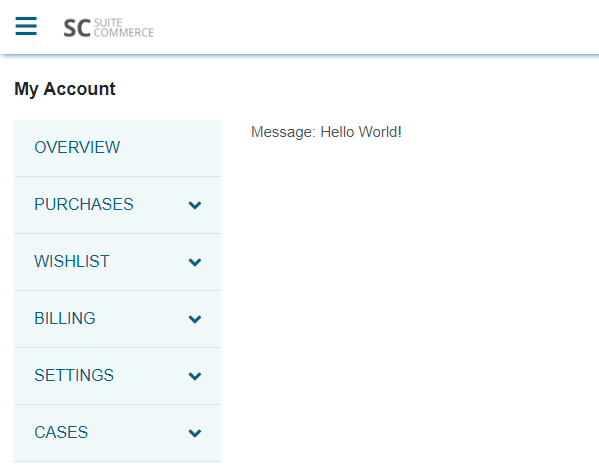
Great! That means that everything has worked successfully, and we’ve rendered a view and a template after visiting a predetermined URL route.
Part 3: Add a Data Model, and Build a Connection from the Frontend to the Backend
So far, we have done some basics around creating a new page to serve content and building a route so that we can visit it. Now, we need to look back at our requirements and start to move onto dealing with data.
Just as we have a special class for dealing with the visual part of our web store application (the view class), we have a special class for handling data; this is called a model.
The model is a data layer and performs many functions related to data, such as synchronizing data between the client (frontend) and the server (backend). Typically, when rendering a view related to data, we will pass it a model.
Create a Frontend Model
In JavaScript, create Example.UserPreferences.Model.js and in it put:
define('Example.UserPreferences.Model',
[
    'SCModel',
    'Utils'
],
function
(
    SCModelModule,
    Utils
) {
    'use strict';

    var SCModel = SCModelModule.SCModel;

    function ExampleUserPreferencesModel () {
        SCModel.call(this);

        // Normally we would define a URL to call for the data
        // But we don't have one, so we'll do that later
        // this.urlRoot = function urlRoot () {...}

        // For now, we'll override the fetch property
        // We'll set some fake data and then return a resolved promise
        this.fetch = function fakeFetch () {
            this.set({message: 'This is fetched data!'});

            return jQuery.Deferred().resolve()
        }
    }

    ExampleUserPreferencesModel.prototype = Object.create(SCModel.prototype);

    ExampleUserPreferencesModel.prototype.constructor = ExampleUserPreferencesModel;

    return ExampleUserPreferencesModel
})
Since 2020.1, all frontend models use the SCModel class included in the extensibility API. It is built on top of a modified version of Backbone.Model. To use it, we add it as a dependency and then extend it to include our own properties. However, this file looks different to what we did with PageType.Base.View so let’s talk about what’s going on.
- The model itself is returned as a property of the module, so we start with a variable which will help as a shorthand.
- We then begin to define the module’s constructor — the function that is called when we create an object of this class.
- As we are using an existing class as a basis, we call that class’s constructor function.
- Normally, we would then set a
urlRootwhich is the location of the server endpoint to which we want to connect to. But we’re going to skip that for now. - For the purposes of this stage of the tutorial, we’re going to fake the process of fetching data by (temporarily) overriding the
fetchmethod. This will set some fake data in the data model and then return a resolved deferred object (which tells the application that the (fake) fetch was successful)
- Outside of the constructor, we set the
prototypeof our model to match those of the superclass (ie, we will need its other methods) - But then doing this overrides the constructor, so we set the constructor to match the one we just created.
- Finally, we return the constructor so that it will be called when this module is called.
Add the Model to the List View
The view will need this data, so we need to tell it to call the model when it itself is loading.
Open Example.UserPreferences.List.View and update your code so it looks like this:
define('Example.UserPreferences.List.View', [
    'PageType.Base.View',
    'Example.UserPreferences.Model',
    'example_userpreferences_list.tpl'
], function (
    PageTypeBaseView,
    ExampleUserPreferencesModel,
    example_userpreferences_list_tpl
) {
    'use strict';

    return PageTypeBaseView.PageTypeBaseView.extend({
        template: example_userpreferences_list_tpl,

        initialize: function initialize () {
            this.model = new ExampleUserPreferencesModel();
        },

        beforeShowContent: function beforeShowContent () {
            return this.model.fetch()
        },

        getContext: function getContext () {
            return {
                message: this.model.get('message')
            }
        }
    })
});
The first thing we have done is update our dependencies; we have:
- Added
'Example.UserPreferences.Model'to the array of dependencies - Named it
ExampleUserPreferencesModelin the callback
Now the module knows it needs the model.
The order of the dependencies array must match the order of the callbacks, otherwise you’ll end up misnaming your dependencies!
Then, we have added an initialize property. This is a built-in property, and many module classes know to look for it — if it exists, this property will be called whenever a new instance of this class is created. In our case, we using this opportunity to set the model of the view by creating a new instance of our model class.
Next, we have also added beforeShowContent. This is another built-in property specific to the PageType.Base.View class. showContent is an event in the SuiteCommerce application that is called when a view is about to be rendered and shown to the user. It is at this time that we want to get the data the view needs — hence why we are calling the model’s fetch().
Finally, we have updated our getContext() function so that the message property looks for data attached to the view’s data model and return that.
Test the New Model
We have created a new file, which means that if you are still running a local server, you need to kill the process as Gulp will not be watching it.
When it has been killed, you can re-run gulp extension:local to restart the process. Note that you don’t need to update the extension manifest is this situation as it will automatically detect the new file.
When it has restarted, you will need to refresh the page or head over to its location. When you get there, you should see the new message!

Add a SuiteScript 2.0 Service and Backend Model
If you have not already done so as part of the standard site setup, you must now deploy your SuiteScript 2.0 SSP application to your domain. If you do not, you will experience issues requesting the service file and will be unable to continue.
So far, we have a contrived example where we override a model’s method — you shouldn’t do this in a production setting and so we need to use the proper NetSuite tools. For that, we have SuiteScript 2.0 and what we call services.
SuiteScript is our proprietary scripting language that is based on JavaScript. Specifically, it is JavaScript which has access to new APIs, methods, and objects and can only be run on NetSuite servers. The ‘2.0’ part refers to the second major version of it — note that SuiteScript 1.0 can and is still used in SuiteCommerce and other parts of NetSuite, but we are in the process of migrating all commerce SuiteScript to 2.0.
A service acts like a RESTful API endpoint. You can define various standard CRUD (create, read, update and delete) method handlers and then pass those on to other bits of code to deal with. Once a response is ready, the service will then send it back to the frontend that called it.
In addition to a service, we can also introduce a backend model. It is not strictly required that you add a backend model but we consider it good practice to do so. Generally speaking, you want your service file to act purely as the API/handler and then break out the business logic into a separate module. In short, when you have multiple service files, you should notice a level of uniformity between them, and your backend models should look rather varied.
Note that there is a lot to learn about SuiteScript and this tutorial just covers the essentials. For more information, you can take our training on SuiteScript 2.0 and read our documentation.
Create a Service File
In very old versions of SuiteCommerce Advanced, we used to create service files manually and then the concept of service controllers were brought in, as an extendable class. This is no longer the case in modern versions of SuiteCommerce.
In SuiteScript2, create Example.UserPreferences.Service.ss and in it put:
/**
* @NApiVersion 2.x
* @NModuleScope Public
*/
define([
    './Example.UserPreferences.Model'
], function (
    ExampleUserPreferencesModel
) {
    'use strict';

    function service (context) {
        var response = {};

        switch (context.request.method) {
            case 'GET':
                response = ExampleUserPreferencesModel.get(context.request)
                break;
        }

        context.response.write(JSON.stringify(response));
    }

    return {
        service: service
    }
})
SuiteScript 2.0 service files look like other modules you’ll find in an extension, but there are some notable differences.
Firstly, we start by defining some metadata at the top of the page. In many cases this is not strictly necessary, but we do it because it often is and it is good to have consistency! In our case, we are stating that we are using the latest version of SuiteScript (denoted by using 2.x); then we define the scope of the file, which is Public, which means that any script from within the account can load and use the module.
Then we move on to our define block. Note that, unlike frontend SuiteCommerce modules, we do not include a name at the beginning of the statement — NetSuite always uses a file’s name and location to identify and locate our custom modules.
Accordingly, we add one dependency and reference it by location and file name — a yet uncreated Example.UserPreferences.Model. Note the notation at the beginning: ./ — this file is going to reside in the same directory as the service file, so we’re going to find it by pointing to the relative path of the current directory and its filename.
When it comes to defining your service files there’s a few way of designing something like this, but my preferred way is to have one big wrapper function that is always called, and then put our individual functions within it. What we must do is, at the end, return an object that has a service property that points to a callback we have already defined.
So, we create a service function, passing in a context parameter. The context parameter makes a frequent appearance throughout SuiteScript but varies depending on the type of SuiteScript you’re writing. In our case, we’re working with web services that connect from the frontend of a web store, so it will contain a bunch of standard HTTP-related properties such as the request body and method. But it’s also important to note that this is object has been modified by the NetSuite application first, so it will also contain additional useful things that we can use. One such example is a predefined property for replying to the request, called response.
OK, so we’re defining a handler for service requests — what do we do? We start by setting up an empty object which will contain the response we want to send.
Then we set up a switch — as this function is always called when the service is requested, we need to first understand what it is the user wants us to do. The basis for determining what the user wants to do is to check what type of CRUD method they sent in the request.
We’re starting with a simple GET, so we set up a case check for that. If true, we call our model’s get() method and pass in the request object — that’ll then do a bunch of work and return something (ie a data object). This object will then be stringified and written to the response object; if we didn’t stringify, it would just return [object Object], which isn’t very useful!
In short, generally speaking, when sending or receiving object data between the client and server it will need to be stringified first. When it is received (on either side) it will then need to be parsed. If you use standard classes (such as SCModel) then this will be handled on the client side automatically.
Finally, we have a return statement for the module, which simply returns our service function. As previously mentioned, this will always be called to handle requests when we call the service.
Create a Backend Model
In the context of a service, we use a backend model to perform the business logic of a request after a service has handled it. This can include things reading or writing records.
Strictly speaking, the concept of a ‘backend model’ doesn’t really exist, or, at least, not as rigidly as it does in the frontend architecture. However, while we employ it as a sign of parity between the frontend data layer and the backend one, there isn’t a backend model class that we extend or call.
Older versions of SuiteCommerce Advanced did have a backend model class, but there is no SuiteScript 2.0 equivalent available in extensions.
In SuiteScript2, create Example.UserPreferences.Model.js and in it put:
/**
* @NApiVersion 2.x
* @NModuleScope TargetAccount
*/
define([], function () {
    'use strict';

    var ExampleUserPreferencesModel = {
        get: function (request) {
            var data = {
                message: 'This is a message sent from the server!'
            }

            return data
        }
    }

    return ExampleUserPreferencesModel
})
We start by setting metadata — we set the scope to TargetAccount which is more restrictive than Public but it doesn’t really make much difference so we’re not going to discuss it.
After enabling strict mode, we create an object to which we will attach our methods. Note that even though I’m naming them so that they match the HTTP CRUD methods that will call them, you don’t have to do this. However, for the sake of simplicity, you’ll probably want to name your methods similarly.
In our get() method, we create a simple object that contains some fake data. Later, this’ll handle real records, but, for now, let’s just go with this.
Finally, we return the main object.
Update the Frontend Model to Call the Service
Now, we need to be able to call this new service and backend model. To do this, we need to make a quick change to the frontend model.
Open JavaScript/Example.UserPreferences.Model.js and replace its contents with:
define('Example.UserPreferences.Model',
[
    'SCModel',
    'Utils'
],
function
(
    SCModelModule,
    Utils
) {
    'use strict';

    var SCModel = SCModelModule.SCModel;

    function ExampleUserPreferencesModel () {
        SCModel.call(this);

        this.urlRoot = function urlRoot () {
            return Utils.getAbsoluteUrl(
                getExtensionAssetsPath(
                    "Modules/UserPreferences/SuiteScript2/Example.UserPreferences.Service.ss"
                ), true
            )
        }
    }

    ExampleUserPreferencesModel.prototype = Object.create(SCModel.prototype);
    ExampleUserPreferencesModel.prototype.constructor = ExampleUserPreferencesModel;

    return ExampleUserPreferencesModel
})
What we have done here is replace the fetch override with an actual call to the service file. We do this by declaring its urlRoot property on our custom class.
It’s important to note that when we deploy an extension’s service file, it will be stored in a rather deep directory structure in the public-facing Website Hosting Files in the File Cabinet. The directory path is prone to change and so you should never hardcode this value. However, we have a couple of utility functions you can rely on to create a dynamic path to it:
Utils.getAbsoluteUrl()— this generates the first part of the URL path: the protocol, domain name, and SSP application namegetExtensionAssetsPath()— this generates the second part: the folder structure where this site’s extensions will be stored (taking into account the vendor of the extension, its name, and its version)
To illustrate this, compare this example URL and the parts we can generate dynamically:
// Example URL
https://shop.example.com/sca-dev-2020-2-0_ss2/extensions/ExampleVendor/Example/1.0.0/Modules/UserPreferences/SuiteScript2/Example.UserPreferences.Service.ss?c=123456&n=8&internalid=1&_=1610986106400

// How it is generated
[Utils.getAbsoluteUrl][getExtensionAssetsPath]Modules/UserPreferences/SuiteScript2/Example.UserPreferences.Service.ss[form data and other built-in code]
Finally, note the trailing true in getAbsoluteUrl: this must be used when the service you are requesting is a SuiteScript 2.x service. If it is SuiteScript 1.0, you must not include this.
Test the Service File
Any changes to backend code (ie SuiteScript) in an extension cannot be tested locally without deploying and activating first. (Local versions of extensions always use the live, production versions of SuiteScript.)
If you’re still running the local server, you’ll need to kill the process. Run gulp extension:update-manifest to update your manifest. It will ask you what kind of file Example.UserPreferences.Model.js is — select None (despite what the prompt says, do NOT select SuiteScript as it is referring to SuiteScript 1.0).
When the task finishes, look in manifest.json — you should see a suitescript2 object at the bottom of the file. If not, you’ll need to add them manually like this:
"suitescript2": {
    "files": [
        "Modules/UserPreferences/SuiteScript2/Example.UserPreferences.Model.js",
        "Modules/UserPreferences/SuiteScript2/Example.UserPreferences.Service.ss"
    ]
}
Make sure you put in a comma on the preceding line.
Now, we’re ready to deploy and activate!
Run gulp extension:deploy and begin the process of sending up the files. When it has deployed, you’ll need to reactivate the extension on your site. Once that has completed, you can visit the page on your site using the #/preferences hashtag. When it loads, you should see the new message waiting for you!

Part 4: Set Up Records and Implement the Create/POST Action
So far, we have created a contrived example that allows a user to visit a page on our website, make a call to the server, and receive dummy data back. But this is a long way from a fully working example which involves the full array of standard HTTP operations using real data.
In this section we’re going to:
- Set up custom records in NetSuite to store our data
- Create a form so that the user can create new and update existing records
- Implement functionality to send POST requests to the server
- Add SuiteScript that handles the request and creates new records
Create the Record Type in NetSuite
Before a user can create ‘user preferences’ in NetSuite, we must firm define what exactly a user preference is.
In NetSuite, go to Customization > Lists, Records, & Fields > Record Types > New and then set it up as follows:
- Label: User Preferences
- ID: _user_preferences
- Include Name Field: (unchecked)
- Access Type: Use Permission List
- Show ID: (checked)
- Permissions Tab:
- Role: Customer Center
- Level: Full
- Restrict: Viewing and Editing
Make sure you click Add in the Permissions tab to add that permission to the table, and then click Save to add the record type. Leave all other settings on their default values.
Next, the permissions are set up so that customers will be able to read, edit and delete only the records they own.
After saving, the page reloads and the Fields tab should now be visible. We're now going to create the fields we need to store data in.
For each of these, click New Field to start:
- Label: Owner
- ID: _user_preferences_owner
- Type: List/Record
- List/Record: Customer
- Validation & Defaulting Tab:
- Mandatory: (checked)
This one will be used to store the ID of the user who created it. This is how we'll know what records the shopper can access.
- Label: Type
- ID: _user_preferences_type
- Type: List/Record
- List/Record: New
- Name: Type
- ID: _user_preferences_type
- Values: Color, Size
- Validation & Defaulting Tab:
- Mandatory: (checked)
This'll be used to store the type of preference. We're creating a custom list for this because we want to limit the values that the user enters. In other words, we're going to create a dropdown from which users can select the value they want.
- Label: Value
- ID: _user_preferences_value
- Type: Free-Form Text
- Validation & Defaulting Tab:
- Mandatory: (checked)
Allowing users to set their preferred size or color as a string rather than from predetermined list is a little sub-optimal. After all, we just said we want to limit the user's inputs, but to be perfectly honest it would complicate things quite significantly, detouring us from the purpose of this tutorial. So, yes, therefore, we are going to stick with free-form text.
Add a New Page Type for the Edit View
The first action we’re going to implement is the ability for users to create records through the UI. In order to do this, we will need a new layout page (route) for users to go to, and a form that shows them their options that, when submitted, creates a record in the system.
In JavaScript, open Example.UserPreferences.js and add a new dependency:
Example.UserPreferences.Edit.ViewasExampleUserPreferencesEditView
Then, in the mountToApp method, add the following:
PageType.registerPageType({
    name: 'example_userpreferences_edit',
    routes: ['preferences/add', 'preferences/:id'],
    view: ExampleUserPreferencesEditView,
    defaultTemplate: {
        name: 'example_userpreferences_edit.tpl',
        displayName: 'User Preferences Edit'
    }
});
This means that when a user navigates to #/preferences/add they will load this new view.
Add an Edit View
An ‘edit view’ is a page where the user is allowed to create a new record or edit an existing one. It typically renders a form.
In JavaScript, create Example.UserPreferences.Edit.View.js and in it put:
define('Example.UserPreferences.Edit.View', [
    'PageType.Base.View',
    'Example.UserPreferences.Form.View',
    'Example.UserPreferences.Model',
    'example_userpreferences_edit.tpl',
    'jQuery'
], function (
    PageTypeBaseView,
    ExampleUserPreferencesFormView,
    ExampleUserPreferencesModel,
    example_userpreferences_edit_tpl,
    jQuery
) {
    'use strict';

    return PageTypeBaseView.PageTypeBaseView.extend({
        template: example_userpreferences_edit_tpl,

        initialize: function initialize () {
            this.model = new ExampleUserPreferencesModel();
        },

        beforeShowContent: function beforeShowContent () {
            this.childViews = {
                'Example.UserPreferences.Form.View': function () {
                    return new ExampleUserPreferencesFormView({
                        model: this.model
                    })
                }
            }

            if (!!Number(this.options.routerArguments[0])) {
                return this.model.fetch({
                    data: {internalid: this.options.routerArguments[0]}
                })
            }
            else {
                return jQuery.Deferred().resolve()
            }
        }
    })
})
We start with the module’s dependencies. As this is a layout page (ie one with a navigable route), we use the PageType.Base.View module, which is what we’re going to extend.
Then we add a dependency to another view: Example.UserPreferences.Form.View. In order to render a form, we must use a special class of view called a form view. In the extensibility layer, we will have to use SCFormView as a base, but we’ll create that in a moment.
We then include our extension’s model — remember that models have a 1:1 mapping to records, so including it whenever we reference a single record (like we do when we are dealing with forms) is required.
Next is a reference to the template we’ll be using to render the page.
Finally, we add jQuery. Strictly speaking, you don’t need to add jQuery as a dependency as it is available globally but it is good practice to include it when you use it.
After the dependencies, we begin to build out the module proper. We start as we normally do by defining the template, and then the initialize statement. When the view is instanced, we want it to ready a new instance of the model — this will either be populated with existing record data via a fetch, or kept empty so that the user can create a new record.
In our beforeShowContent property, we are doing something a bit different. As mentioned, we’re going to use a specialized ‘form view’ to show the form to the user. But we can’t add it directly to the existing view, so we have to use the concept of ‘child views’. Child views are views that are added to another view and are rendered when the parent view is rendered. This makes it easier to modularize your code and reuse views and templates in multiple places on your site.
To do this, we tell the module to add a new property called childViews (which is a reserved property name) to the module. We pass in an object: the key is the name we want to give the view (which usually matches the name of the view itself) and then a callback that invokes an instance of the view. Our callback returns an instance of Example.UserPreferences.Form.View, which has been passed the model.
Speaking of the model, we are doing a second novel thing in our beforeShowContent property. By default, whenever a new page type base view is invoked, it will automatically be passed the router arguments that called it. These arguments are the additional parts of the URL that were included when the request was made.
Remember how when a user requests this view, it is because they have called a route that looks like either preferences/add or preferences/:id? Well, the bit after the preferences/ in the URL is passed along as a routerArgument. This is helpful because it enables us to perform logic on it. Specifically, we know that if they request a URL with a :id part (which is just a placeholder name) then they are requesting to view/edit a record that already exists.
In our case, we are assessing whether it can be converted to a number — if it can, we assume that the user requested a specific user preference and pass it to the model to fetch. Note that when we pass this internal ID on to the model, we must use a specific data structure for the object. Finally, in this case, we return the fetch request for the model, which returns a deferred object — so the application will wait for GET to complete before rendering the page.
Now, if this parameter doesn’t exist or it isn’t a number, then we assume that the user wants to create a new record, so we don’t do anything else other than return a resolved deferred object — this will tell the view that all additional necessary work has been done, and the page can be displayed (which, by default, will be an empty form).
Add an Edit Template
In Templates, create example_userpreferences_edit.tpl and in put:
<h2>Add/Edit User Preference</h2>
<div data-view="Example.UserPreferences.Form.View"></div>
We add a heading to the page, but then we add an empty div element with a data-view attribute on it. Why?
Remember how, in the edit view, we created a childViews object that used Example.UserPreferences.Form.View as its object key? Well, when the template is processed, it will look for a data-view attribute that has that value and then render the HTML of the child view there.
Add a Form View
As mentioned, the form view is used specifically to show a form to the user. To do this, we will use the SCFormView module, which is part of the extensibility API, as it has a lot of built-in wiring to make the processing of form data super easy.
In JavaScript, create Example.UserPreferences.Form.View.js and in it put:
define('Example.UserPreferences.Form.View', [
    'Backbone',
    'SCFormView',
    'Example.UserPreferences.Helper',
    'Utils',
    'example_userpreferences_form.tpl'
], function (
    Backbone,
    SCFormViewModule,
    ExampleUserPreferencesHelper,
    Utils,
    example_userpreferences_form_tpl
) {
    'use strict';

    var SCFormView = SCFormViewModule.SCFormView;

    function ExampleUserPreferencesFormView (options) {
        SCFormView.call(this, options.model);

        this.formModel.on('sync', function () {
            Backbone.history.navigate('preferences', {trigger: true});
        });

        this.template = example_userpreferences_form_tpl;
    }

    ExampleUserPreferencesFormView.prototype = Object.create(SCFormView.prototype)
    ExampleUserPreferencesFormView.prototype.constructor = ExampleUserPreferencesFormView;

    ExampleUserPreferencesFormView.prototype.getEvents = function () {
        return {
            'submit form': 'saveForm'
        }
    }

    ExampleUserPreferencesFormView.prototype.saveForm = function (e) {
        e.preventDefault();

        var promise = SCFormView.prototype.saveForm.call(this, e);

        return promise
    }

    ExampleUserPreferencesFormView.prototype.getFormValues = function (form) {
        var formValues = form.serializeObject();

        return {
            type: formValues.type,
            value: formValues.value
        }
    }

    ExampleUserPreferencesFormView.prototype.getContext = function () {
        return {
            model: this.formModel,
            typeOptions: ExampleUserPreferencesHelper.getTypeOptions()
        }
    }

    return ExampleUserPreferencesFormView
})
In our dependencies, we add the aforementioned SCFormView, Utils, and a template that we will create to render the form. But we also do some things new: first, we include Backbone (which is the standard library we use as the basis for our sites’ architecture) and we include a helper file.
Like jQuery, Backbone is globally available, but we add it as a dependency as a measure of good practice when we use it in modules.
Although not created yet, the helper file is module you can include with your extension which stores utility functions your extension might need. Sometimes, you will have code that is generic enough that it can be extracted from where you might ordinarily put it and called separately. This allows you to use it in multiple modules in your extension, and help keep individual modules clean and easy to read.
In the module proper, we start by creating a variable for the form view’s base class.
Then, we start creating our constructor. We start by invoking the constructor of the base class, passing in the model we included in the parent view.
Now, once the model has been attached to the class, it will be assigned to the formModel property (which is a mild divergence from model, which is used in other classes). You will see that we are then binding an event to the model — specifically, we are telling it to listen for a sync event, which is when data is either sent or received to or from the server successfully. Once the user’s data has been successfully sent to the server, there’s no reason for them to remain on the page — so our event is a simple trigger to issue a redirect back to the list page.
Then we close out the constructor by specifying which template it should use when it is rendered.
After that, two standard activities when dealing with this class: we attach the base class’s prototype to our custom class, and then set our newly defined constructor as the constructor for the custom class.
Next is getEvents. This property is used to attach handlers to events that might happen in the UI. We must declare a function that returns an object. This object must set its keys to the events, and its values to callbacks to handle those events. Specifically, the event declarations follow jQuery’s pattern for selectors; in our example, we will listen for the form to be submitted and then call a built-in handler for form submission.
While we will use the built-in handler, we can still define some additional things to be done when called. In our example saveForm, we are actually not doing anything extra of note — we simply call the base class’s saveForm method, but you could do other things that handle success/failure states, but we’re going to leave those out.
The next property is getFormValues. This property is a bridge between the form UI and the JavaScript that handles data. At a minimum, this property must return an object that maps the names of properties in the model to the inputs in the form. Before that, however, you can also use the function to perform other tasks, such as mapping or transformation — later, we will modify this to perform validation. At the moment, we use a custom serializeObject() function to create a workable JSON object from the form values and then return it.
Finally, we create a context object for the template. In this object, we are passing in the model and the ‘type options’ from our yet-to-be-created helper file. The reason for this is because we know that we have defined only two possible user preferences: size and color. What we want to do is not only generate a select element that shows these options but also run a comparison between the options and the model. If a user is editing an existing user preference, we want to add the selected attribute to it so that it is pre-selected when they see the form.
Add a Helper File
Helper files contain utility functions that are general enough to be used throughout an extension and can be extracted to a standalone file. Putting the functions in a separate file can improve code reusability, as well cut down the size of individual files.
In JavaScript, create Example.UserPreferences.Helper.js and in put:
define('Example.UserPreferences.Helper', [
    'Utils'
], function (
    Utils
) {
    'use strict';

    return {
        getTypeOptions: function getTypeOptions () {
            return [
                {internalid: '1', name: Utils.translate('Color')},
                {internalid: '2', name: Utils.translate('Size')}
            ];
        }
    }
})
You should be familiar with the format of the file by now, so let’s skip to what it does.
User preference types (color and size) are custom records in the NetSuite application and will be referenced in SuiteCommerce and SuiteScript by their internal IDs. As we’ve only created two types, they will use numbers 1 and 2. However, simply showing numbers to users isn’t particularly useful and what we want to show them are names instead. This means we must create some sort of map between the two.
Now, ideally, we would get all this information from NetSuite. However, in the interests of brevity, we won’t do that in this tutorial. So, for now, we’re going to do just a little bit of hardcoding and simply set up the module so that it returns an array mapping internal IDs to their strings.
For reference, you could also set up the schema of a map in the configuration record and ask the user to add in their own map configuration. Then, using the Environment component’s
getConfig()method, fetch the map.
We are, however, going to use the translate() utility function. This function, which is also available in templates, takes a string in your site’s base language (usually American English) and then returns a translated string depending on the current user’s selected language. You should use this whenever you plan to show text to the user.
Create a Form Template
The form template is the template the form view will use to render the form element and its fields.
In Templates, create example_userpreferences_form.tpl and in put:
<div class="alert-placeholder" data-type="alert-placeholder"></div>
<form>
    <fieldset>
        <div data-validation="control-group">
            <label for="type">{{translate 'Type'}}</label>
            <div data-validation="control">
                <select name="type" id="type">
                    {{#each typeOptions}}
                        <option value="{{internalid}}" {{#ifEquals internalid ../model.type}}selected{{/ifEquals}}>{{name}}</option>
                    {{/each}}
                </select>
            </div>
        </div>

        <div data-validation="control-group">
            <label for="value">{{translate 'Value'}}</label>
            <div data-validation="control">
                <input type="text" name="value" id="value" value="{{model.value}}">
            </div>
        </div>
    </fieldset>
    <button type="submit">{{translate 'Add/Update'}}</button>
</form>
This is, perhaps, our first interesting template, so let’s spend a little bit of time looking at what’s happening here.
At the top, we have a placeholder element marked up with a data-type="alert-placeholder" attribute. This is a bit of SuiteCommerce boilerplate I would recommend including whenever you’re writing a template that deals with forms or other AJAX: when an error is generated by the application, if it is not told to go to a specific place it will look for the closest placeholder. In other words, if there is an unexpected error with the form, it will bubble its way to here, which makes sense. Not mandatory, but a good idea.
Next we have some standard HTML for forms and field sets. But you’ll notice that we are marking up some elements with data-validation="control-group" and data-validation="control" — these are required for data validation. When we add validation later, this markup will associate error messages with the appropriate places to show them and help show errors inline.
The first input we include in the form is a select field, which will be used to show the preference type options in a dropdown. The interesting part is an #each function. Handlebars has many block helpers and this one lets us iterate over an array.
In our case, we want to produce an option element for each preference type option. But within that block, we also have something called #ifEquals — what’s going on here? Although Handlebars promotes ‘logicless’ templating (which means that logic operations should be done in the view and not the template) we do, sometimes, want to do it in the template. In our case, we want to compare the iteratee type options against the type in the model. If they match (ie because we have loaded an existing user preference) we want to add the selected attribute to the option so that it shows the correct option when the user comes to edit the record.
The ifEquals helper isn’t standard Handlebars functionality, however, and in order for it to be available it on our templates, the NetSuite developers had to add it to the core bundle as a custom Handlebars helper.
After the select element we add a text input for the value of the preference. Note how we set its value attribute to be the value found in the model: if it exists, it will set it the input to match it; if it doesn’t, it’ll be blank.
We close out the template with the submit button — nothing fancy here!
Add a POST Method Handler to the Service
So, we have everything set up to show a form but it doesn’t connect to the backend in any way. If you were to kill your local server, restart it, and then visit preferences/add on your local version of your My Account, you will see a form displayed!
Now, we need to set up the backend to handle the requests!
In SuiteScript2, open Example.UserPreferences.Service.ss and, in the switch statement, add a new case:
case 'POST':
    response = ExampleUserPreferencesModel.post(context.request)
    break;
This will create a handler for the POST HTTP method, calling the backend model’s put() method, passing in the request object.
Add a POST Method to the Backend Model
When it the backend model receives the data from the service file, it needs to create a record using that data and then return a status (eg, a success indicator).
In SuiteScript2, open Example.UserPreferences.Model.js and add two dependencies:
N/recordasrecordN/runtimeasruntime
Then, add a new property to the ExampleUserPreferencesModel object:
post: function (request) {
    var body = JSON.parse(request.body);

    var userPreferences = record.create({
        type: 'customrecord_user_preferences'
    });

    userPreferences.setValue({
        fieldId: 'custrecord_user_preferences_owner',
        value: runtime.getCurrentUser().id
    });

    userPreferences.setValue({
        fieldId: 'custrecord_user_preferences_type',
        value: body.type
    });

    userPreferences.setValue({
        fieldId: 'custrecord_user_preferences_value',
        value: body.value
    });

    return userPreferences.save()
}
Remember to add a comma to the preceding get property!
The first thing we do is parse the body of the request. As a reminder: form data is transmitted to the server as an object comprising the request’s body (rather than, say, as parameters); furthermore, before it is sent, it is stringified so the first thing we must do is parse that string.
When we have the data ready, we the use the standard SuiteScript 2.0 interface for records: N/record. This module has a number of easy-to-use methods for dealing with records — importantly, here, it has the create() method, which we call.
Now, there’s some important things to note here. Firstly, when you call create() you’re not actually creating a record in the database; instead, you’re doing something more conceptual. You pass in the type of record you want to create and call it, and the system is effectively ‘readying’ a record to be created.
When the record is ready, we then set its values. The most straight-forward way of doing this is to use setValue() and pass in an object.
Note how, when it comes to setting the owner of the record, we reference a method attached to the N/runtime module. The getCurrentUser() method returns useful data about the current user, such as name and email, but, importantly for us, their internal ID.
For the rest of the object’s values, we simply pass in values from the request body.
Then, finally, we call save() on the record — this is the actual method that creates the record in the database. We return its value, which, in this case, will be the internal ID of the newly created record.
Test Creating a Record
We’ve just made changes to the backend files and, as a reminder, these are not things that we can test locally — therefore we need to deploy and activate our extension.
Kill the local server and run gulp extension:deploy; remember to choose the None option when asked what kind of file your SuiteScript file is. After deploying, activate the extension.
What that has finished, visit the page on your site. You should see the form load, so enter some test data and hit Submit.

If it redirects you back to the list page, that means it’s been successful. To check this, go to NetSuite and find the record by going to Customization > Lists, Records & Fields > Record Types and then clicking List next to the User Preferences record type. You should see a record there, which, if you view, should look like this:

Success!
Part 5: Implement the Read/GET Action
Now that we can create records, we need to introduce code for the user to be able to view their existing records. There’s two ways that a user might do this:
- By visiting /preferences to see a list of all their records
- By visiting /preferences/:id to see a single record (where :id denotes a specific a specific record internal ID)
Models are great for dealing with individual records, but not groups of records. In order to handle these groups, we need to introduce the concept of collections. Collections are arrays of models; specifically, they are arrays of models of the same type. This means that when you want to deal with more than user preference record — like you do in a list — you need to use a collection.
At the moment, our list page is not very functional — it just displays a simple message sent from the server. What we want it do is display a list of all the users’ preferences. Therefore, instead of fetching a single model, we will need to do a number of things:
- Update the list view so that it fetches a collection of user preference models and renders a view of that collection
- Add a collection to handle a group of models
- Add a collection view to render a container for that collection
- Add a details view, used to render individual models in the collection
- Update the list template so that it includes a placeholder for the collection view to render in
- Add a new template to render the container of the collection
- Add a new template to render the individual rows of the collection
- Update the model to support existing models and collections
- Update the backend model to fetch a list of records, and individual records
An easy way of thinking of collections and models is to think of collections as a big table of results. It is the table itself, with the header row that defines all the columns of data we want to show. Each model represents a row of data, which is designed to present each bit of data as a cell. In fact, that’s exactly what we’re going to do: we’re going to present the list as a table!
Update the List View to Use Collections
In order for the list view to render a list of records, we must change it so that it fetches a collection of records.
In JavaScript, open Example.UserPreferences.List.View.js and replace its contents with:
define('Example.UserPreferences.List.View', [
    'PageType.Base.View',
    'Example.UserPreferences.Collection',
    'Example.UserPreferences.Collection.View',
    'example_userpreferences_list.tpl'
], function (
    PageTypeBaseView,
    ExampleUserPreferencesCollection,
    ExampleUserPreferencesCollectionView,
    example_userpreferences_list_tpl
) {
    'use strict';

    return PageTypeBaseView.PageTypeBaseView.extend({
        template: example_userpreferences_list_tpl,

        initialize: function initialize () {
            this.collection = new ExampleUserPreferencesCollection();
        },

        beforeShowContent: function beforeShowContent () {
            this.childViews = {
                'Example.UserPreferences.Collection.View': function () {
                    return new ExampleUserPreferencesCollectionView({
                        collection: this.collection
                    })
                }
            }

            return this.collection.fetch()
        }
    })
});
With the dependencies, we have removed the model and added in references to two yet-to-be-created classes:
- The collection, which is a way of handling multiple models of the same type
- The collection view, which will render the collection of models
Accordingly, in the initialize() method, we’re going to instance the collection instead of the existing model.
In beforeShowContent, we’re doing the now-familiar activity of adding in a child view. We’re passing in the collection we just instanced. Finally, we return the call to fetch the collection (which will be a promise object) and the view will render only once that completes.
We have removed the getContext property as it is no longer required, and it is not a mandatory property in this class.
Add a Collection
In JavaScript, create Example.UserPreferences.Collection.js and in it put:
define('Example.UserPreferences.Collection', [
    'SCCollection',
    'Example.UserPreferences.Model',
    'Utils'
], function (
    SCCollectionModule,
    ExampleUserPreferencesModel,
    Utils
) {
    'use strict';

    var SCCollection = SCCollectionModule.SCCollection;

    function ExampleUserPreferencesCollection(models, options) {
        SCCollection.call(this, models, options);

        this.model = ExampleUserPreferencesModel;
        this.url = function () {
            return Utils.getAbsoluteUrl(
                getExtensionAssetsPath(
                    "Modules/UserPreferences/SuiteScript2/Example.UserPreferences.Service.ss"
                ), true
            )
        }
    }

    ExampleUserPreferencesCollection.prototype = Object.create(SCCollection.prototype);
    ExampleUserPreferencesCollection.prototype.constructor = ExampleUserPreferencesCollection;

    return ExampleUserPreferencesCollection
})
Our dependencies include the SCCollection class, which is our standard collection class provided by the extensibility API. We also include our custom model — a collection is a group of models, so we need to say which model we are going to using.
The collection code looks almost identical to our custom model class. The only main difference is that we must define in our constructor function what model we want to use. We also use the property url rather than urlRoot for defining where to find the service.
Add a Collection View
The collection view is used to render the models. It firstly acts like a container for the entire group of models, but also contains instructions on how to iterate over each of the models.
In JavaScript, create Example.UserPreferences.Collection.View.js and in it put:
define('Example.UserPreferences.Collection.View', [
    'SCCollectionView',
    'Example.UserPreferences.Details.View',
    'example_userpreferences_collection.tpl',
    'jQuery'
], function (
    SCCollectionViewModule,
    ExampleUserPreferencesDetailsView,
    example_userpreferences_collection_tpl,
    jQuery
) {
    'use strict';

    var SCCollectionView = SCCollectionViewModule.SCCollectionView;

    function ExampleUserPreferencesCollectionView (options) {
        SCCollectionView.call(this, options.collection);

        this.collection = options.collection;

        this.template = example_userpreferences_collection_tpl;
    }

    ExampleUserPreferencesCollectionView.prototype = Object.create(SCCollectionView.prototype);
    ExampleUserPreferencesCollectionView.prototype.constructor = ExampleUserPreferencesCollectionView;

    ExampleUserPreferencesCollectionView.prototype.getCellViewsPerRow = function () {
        return 1
    }

    ExampleUserPreferencesCollectionView.prototype.getCellViewInstance = function (model) {
        return new ExampleUserPreferencesDetailsView({
            model: model
        })
    }

    ExampleUserPreferencesCollectionView.prototype.getContext = function () {
        return {}
    }

    return ExampleUserPreferencesCollectionView
})
We once again depend on extensibility API classes, this time SCCollectionView, which is the standard view for collection views. We also include a details view, which we will create later.
Then we move into familiar territory by creating our constructor function, defining the collection we want to use — at this level, the parent view will have passed it in — and the template. We copy the prototype and set the constructor, as per usual.
Next are two interesting new properties specific to collection view. getCellViewsPerRow determines how many ‘cells’ (ie models) to render per row. For the sake of simplicity, I’m going to gloss over this a bit, but you will almost always want one cell per row. If you’re creating a quite compact list view, perhaps to show products, then you might to use 2 or 3, and then you might also need to create a row view as well. We’re not — we’re creating a table, and we want one record per row (so we set the function to return 1).
The second new property is getCellViewInstance, which sets the view you want to render for each cell (model). We’re going to pass in a callback that instances a new version of a details view we haven’t created yet, which itself gets passed the model.
Finally, we set a getContext property — unlike some other kinds of view classes, this property is mandatory in this one even if all you’re doing is returning an empty object.
Add a Details View
The details view will be rendered in the collection view for every model.
In JavaScript, create Example.UserPreferences.Details.View.js and in it put:
define('Example.UserPreferences.Details.View', [
    'SCView',
    'Example.UserPreferences.Helper',
    'example_userpreferences_details.tpl'
], function (
    SCViewModule,
    ExampleUserPreferencesHelper,
    example_userpreferences_details_tpl
) {
    'use strict';

    var SCView = SCViewModule.SCView;

    function ExampleUserPreferencesDetailsView (options) {
        SCView.call(this, options);

        this.model = options.model;

        this.template = example_userpreferences_details_tpl;
    }

    ExampleUserPreferencesDetailsView.prototype = Object.create(SCView.prototype);
    ExampleUserPreferencesDetailsView.prototype.constructor = ExampleUserPreferencesDetailsView;

    ExampleUserPreferencesDetailsView.prototype.getContext = function () {
        return {
            model: this.model,
            typeOptions: ExampleUserPreferencesHelper.getTypeOptions()
        }
    }

    return ExampleUserPreferencesDetailsView
})
This should be relatively straight-forward for you to understand by now! We reference the standard view class in the extensibility API — SCView — and include it in our dependencies.
After that, it is all very familiar! Note in the context object, we pass in the type options from our helper function again — just like on the form template, we’re going to want to print the names of our preference types, not their internal IDs!
Update the List View Template
The list view template is the layout template for the whole page. It can contain whatever we want, but it must contain a placeholder for the collection view to render in.
In Templates, open example_userpreferences_list.tpl and replace its contents with:
<header class="user-preferences-list-header">
    <h2 class="user-preferences-list-title">{{translate 'User Preferences'}}</h2>
    <a class="user-preferences-list-button-new" href="preferences/add">{{translate 'Add New'}}</a>
</header>
<div class="userpreferences-list-table">
    <table>
        <thead>
            <tr>
                <th>{{translate 'Internal ID'}}</th>
                <th>{{translate 'Type'}}</th>
                <th>{{translate 'Value'}}</th>
                <th>{{translate 'Actions'}}</th>
            </tr>
        </thead>
        <tbody data-view="Example.UserPreferences.Collection.View"></tbody>
    </table>
</div>
This template looks more like the beginnings of a list! We’ve added in a heading element and displayed a proper title. We’ve also added in a link to the form page, so users can create a new user preference.
We’ve also added in the start of a table. Importantly, we’ve included everything but the rows! We’ve got the header row, with headings for our columns — but we also have a table body element, which, you’ll note, has the data-view attribute marked up ready for the collection view to be rendered into.
Add a Collection View Template
The collection view template will be used as the container for the rows (or, specifically in our case, cells) in our table.
In Templates, create example_userpreferences_collection.tpl and in it put:
<div data-type="backbone.collection.view.rows"></div>
Eagle-eyed developers will note that when we specified the child view instance for the details view, we didn’t have to give it a name. That is because we are not using the standard childViews property or data-view attribute on our container element — we are using the standard Backbone markup, which is data-type="backbone.collection.view.rows". It also doesn’t really matter what element we use here (ie a div) because it will be completely replaced when rendered.
Add a Details View Template
The details view template will be rendered for each cell (model) in the collection.
In Templates, create example_userpreferences_details.tpl and in it put:
<tr>
    <td>{{model.internalid}}</td>
    <td>
        {{#each typeOptions}}
            {{#ifEquals internalid ../model.type}}{{name}}{{/ifEquals}}
        {{/each}}
    </td>
    <td>{{model.value}}</td>
    <td>
        <a class="user-preferences-table-edit-link" href="/preferences/{{model.internalid}}">{{translate 'Edit'}}</a>
        <button class="user-preferences-table-delete-button" data-action="delete" data-id="{{model.internalid}}">{{translate 'Delete'}}</button>
    </td>
</tr>
For every model, we will create a table row and add in cells for each of the data values we want to show. You’ll note we’re doing a comparison between the type options and the value in the model, so that we can display the name of the type, rather than its internal ID.
We then print the value of the user preference itself, and then a link and a button which we’ll use later when we add support for editing and deleting records. (Although note, for now, how we mark up the Delete button with data-action="delete"!)
Update the Frontend Model to Support Existing Models and Collections
The final part of the frontend changes we need to make are in the frontend model. At the moment, it is only set up to deal with new models (ie creating records) but we need it to also support existing models (ie when we ask it to handle GET requests).
In JavaScript, open Example.UserPreferences.Model.js make the following change:
// Find these lines of code:
function ExampleUserPreferencesModel () {
    SCModel.call(this);

// Replace it with this:
function ExampleUserPreferencesModel (model, options) {
    SCModel.call(this, model, options);
Now when we call the constructor on the base class, it will automatically receive any models or options that are passed to it.
Update the GET Method in the Backend Model
Now that the frontend work is complete, we can move on to the backend. Specifically, we need to change how the model handles GET (read) requests. At the moment, it just sends back a dummy message — now we need it to fetch and return actual records!
In SuiteScript2, open Example.UserPreferences.Model.js and add a new dependency:
N/searchassearch
Then, replace the get property on the ExampleUserPreferencesModel object with:
get: function (request) {
    var type = 'customrecord_user_preferences';

    var filters = [
        ['custrecord_user_preferences_owner', search.Operator.ANYOF, runtime.getCurrentUser().id]
    ];

    var columns = ['internalid', 'custrecord_user_preferences_type', 'custrecord_user_preferences_value'];

    if (request.parameters.internalid) {
        filters.push('and', [
            ['internalid', search.Operator.IS, request.parameters.internalid]
        ]);
    }

    var searchResults = search.create({
        type: type,
        filters: filters,
        columns: columns
    }).run().getRange({start: 0, end: 1000});

    var mappedResults = searchResults.map(function (result) {
        return {
            internalid: result.getValue('internalid'),
            type: result.getValue('custrecord_user_preferences_type'),
            value: result.getValue('custrecord_user_preferences_value')
        }
    });

    return mappedResults.length == 1 ? mappedResults[0] : mappedResults
},
The SuiteScript module we added as a dependency is the standard module for finding and returning records in NetSuite. The get method we added is essentially the process of defining and performing a search, and then performing some transformations on it before returning the results to the service.
Record searches have three essential properties:
- Type — the ID of the type of records you want to search through
- Filters — the search criteria
- Columns — the data you want back
After defining our type, we define our filters. In SuiteScript, the filters are an array of arrays; the individual arrays in the containing array denote an individual filter. In our case, we are specifying that we want to look over each record’s Owner custom field and only return ones that match the current user’s internal ID.
Next we specify what data we want back. Keep in mind, records are stored in databases and so that’s like having a big table with your data in it. Down the side you have rows, which are individual instances of the records, and across the top you have columns, which are the specific data points each record stores. Therefore, when running a search, you must specify which columns’ data you want back. In our case, we specify the internal ID, the preference type, and the preference value.
After that, we have a conditional statement. We have this because this get function serves two similar purposes:
- Get a list of all records a user has created
- Get a specific record a user has created
So far, the search has been defined to get all records — but, if we want just one then it is inefficient to search through and return all results. To optimize things, we can (and do) add in an additional filter if we know that we only need to fetch one particular record.
To do this, we check the request object that has been passed into this method by the service; specifically, we look to see if the internalid parameter has been included. If you remember when we were defining our edit view, we set up the call to fetch the model to include the first URL parameter in the call as internalid if it was a number; it is here, in the backend model, that we make use of the data. If that data was included, we add two additional filters to the container array:
- An
andoperator as a string - An additional array, specifying that the search must only return records that have the same internal ID as the one we passed in
Now, our search is ready, so, next, we perform it. To do this, we invoke the N/search module’s create() method. Much like record.create() above, this takes an object of properties (specifically the ones we just defined) but doesn’t actually perform the search.
That is, not until we invoke run() on it. Note that we are chaining this command onto the end, along with getRange() — this is something you can do with some other methods too! In our case, we run the search and then specify a limit on the results we want back; although we don’t expect the user to have more than 1000, it’s good to add something like this anyway. (Note that if you’re dealing with a lot of results or notice performance problems, look into paginated searches!)
Once the search is done, we perform a map transformation on it. If you think about the how the model is set up on the frontend, we use simple names for values such as type and value, but these are not names under which the data is stored. Accordingly, for the models to understand this data and fit our frontend conceptualization, we iterate over the results and return a new array of results that uses key-value pairings that we want.
Finally, we return the results to the service. Before we do that, however, there is one final transformation that might need to be run. Using a ternary operator, we assess whether there is only one result in the array; if there is, we return just that one result; if there isn’t, we return the entire array set. The reason for this is because of type of class that might receive this data. If the receiving class is a collection then it will accept either an array of objects or an object; if it is a model, then it must be an object — it won’t accept an array.
Test Getting Records
Great! We are now ready to test our work. Save and deploy your extension, and then activate it.
Once that is done, visit /preferences in your site’s My Account application. You should see something like this:

If you then click the Edit link next to the record, you should be taken to the page for editing a specific record. Importantly, your record’s data should be shown in the form inputs. Of course, the Add/Update button won’t work just yet, but we’re making good progress!
Part 6: Implement the Update/PUT Action
At this point, we have an extension that allows users to create new records in the system and then view them (either as a list or individually). There are two actions left to complete, and this part will cover the PUT HTTP method, which allows users to change an existing record.
By implementing the ability to create and read records, we already have much of the architecture in place for the update action; therefore, all we need to do now is make changes to the service and backend model files.
Add a PUT Method Handler to the Service
In SuiteScript2, open Example.UserPreferences.Service.ss and add the following to the switch statement:
case 'PUT':
    response = ExampleUserPreferencesModel.put(context.request)
    break;
When the service evaluates the request method and finds it is a PUT, it will call a new method on the backend model.
Add a PUT Method to the Backend Model
When the backend model receives a request to update a record, it must load the requested record, change its values, and then submit it.
In SuiteScript2, open Example.UserPreferences.Model.js and add a new property to the ExampleUserPreferencesModel object:
put: function (request) {
    var body = JSON.parse(request.body);

    var userPreferences = record.load({
        type: 'customrecord_user_preferences',
        id: request.parameters.internalid
    });

    userPreferences.setValue({
        fieldId: 'custrecord_user_preferences_type',
        value: body.type
    });

    userPreferences.setValue({
        fieldId: 'custrecord_user_preferences_value',
        value: body.value
    });

    return userPreferences.save()
}
Remember to add a comma to the preceding post property!
You’ll notice that this is very familiar to the code we used in the post method. We start by parsing the user’s submitted values in the request body. However, instead of creating a new record or searching for an existing one, we load a specific one with the load() method — notice how we pass in the record type and the internal ID.
After that, we use the familiar value setting method to set the values on the record, and then we save it.
Test Updating Records
Small changes in this part, so redeploy and reactivate the extension. When the extension is ready, head over to /preferences and edit an existing record. Change the values, and then save the record again. It should go through and your new values should be reflected in the record list!
Part 7: Implement the DELETE/Remove Action
The final method to implement is the one that removes records. The backend code for this is very straight-forward, but there’s also a little bit of frontend code we need to add. Specifically, we need to bind the user clicking on a Delete button next to a record in the list, we the backend action of removing a record.
Update the Collection View to Listen for Remove Actions
Because we expose the ability to delete records on the list page, it is there that we will bind the action of clicking on a Delete button with the remove action.
In JavaScript, open Example.UserPreferences.Collection.View.js and add this to the ExampleUserPreferencesCollectionView constructor function:
var self = this;
this.collection.on('reset sync add remove change destroy', function () {
  self.render();
});

this.removeUserPreference = function (e) {
    e.preventDefault();

    var id = jQuery(e.target).data('id');
    var model = this.collection.get(id);
    model.destroy();
}
The first bit of code is aesthetic: we are adding an event listener and handler to the collection that checks for a variety of events that could happen to it. Although a bit overkill, we’re essentially telling it to listen for any event; when one of them happens, we trigger the collection view (the outer scope, designated by self) to re-render. We’re doing this because we know that if the user successfully deletes a record, it will no longer be present in the list — therefore, we should refresh the list to no longer show it there.
Next, we create a callback to handle the user clicking a Delete button to the remove action. Clicking the button will send in an event, which we immediately mute. Using that event, we extract the internal ID associated with the Delete button by asking jQuery to read the data-id attribute we added to the button in the details template. Using that, we can find the appropriate model in the collection; once we have that, we then trigger the destroy() method on it, which is a standard Backbone model that deals with the frontend aspect of the DELETE method (ie triggers a request to the service file to delete record).
After creating a handler, we need to bind the event to the user action itself. Within the same file but outside of this constructor, add a new property to its prototype:
ExampleUserPreferencesCollectionView.prototype.getEvents = function () {
    return {
        'click button[data-action="delete"]': 'removeUserPreference'
    }
}
We discussed getEvents in a previous section. What we’re doing here is listening for when the user clicks on a Delete button (designated by the data-action attribute we set in the details template) and mapping it to the removeUserPreference callback we just defined.
Add a DELETE Method Handler to the Service
In SuiteScript2, open Example.UserPreferences.Service.ss and add the following to the switch statement:
case 'DELETE':
    response = ExampleUserPreferencesModel.delete(context.request)
    break;
When the service evaluates the request method and finds it is a DELETE, it will call the delete() method on the backend model.
Add a DELETE Method to the Backend Model
When the backend model receives a request to delete a record, it must issue a command to do so.
In SuiteScript2, open Example.UserPreferences.Model.js and add a new property to the ExampleUserPreferencesModel object:
delete: function (request) {
    return record.delete({
        type: 'customrecord_user_preferences',
        id: request.parameters.internalid
    })
}
Remember to add a comma to the preceding put property!
This is very straight-forward! N/record has a delete() method that accepts an object containing a record type and ID. If successful, it will return the ID of the deleted record.
Test Deleting Records
As before, redeploy and reactivate the extension and head to the user preferences list page. Now, when you click Delete next to a record, it should remove it and the list refresh to no longer show it there!
Part 8: Add Validation and Security
We’ve now fully implemented all CRUD elements of this extension, and we’re nearly at the point where we can move on to the aesthetic parts. However, there are two small pieces of the data part that we need to think about:
- Form data validation
- Security
Validate Data Before Submit
When we create or update records, we know that there are requirements the user needs to meet before the action will succeed. Throughout the web store, there are many forms that accept many different kinds of data — even without checking the veracity of that data, we know that there are patterns this data must follow if they are to be accepted. For example, if we are asking for an email address then we know that it must contain (at a minimum) an @ symbol and a period, and we can write code to check that.
The form in our extension is not that complicated: we’re only have two inputs and, generally speaking, we’re just saying that the user must provide some data. In other words, we must check that the fields are marked as required.
Importantly, checking this data on the frontend means that we can improve performance and save resources: if we can test the data on the user’s device first, we can short-circuit requests to the backend, which gives immediate feedback to the user, and prevents the backend from performing actions we know will fail.
You can test your form without validation to see what happens: go to create a user preference and open your developer tools. While watching Network > XHR, just submit the form. The request will fail with a 500 error: specifically, a SuiteScript INVALID_FLD_VALUE error will occur that says that we have a field with an invalid value (ie it is empty). You’ll also get a noisy console log as the error is reported in multiple different ways, including a couple of Impossible to parse backend error messages!
To prevent this from happening, let’s add in some validation!
Add a Method to the Helper that Returns Type Options IDs
Before we get into the details, we must first add in a new method to our helper file.
One of the validations we want to do is check whether the user’s submitted type is correct. Remember, we created our helper file to return an object of available types, so in order to perform a type ID ‘search’, we’re going to create a function takes that object and returns a nice flat array of the internal IDs. We’ll go into more detail when we look at the validation in the model.
For now, open Example.UserPreferences.Helper.js in JavaScript, and in it add a new property:
getTypeOptionIds: function getTypeOptionIds () {
    var ids = [];

    this.getTypeOptions().forEach(function (option) {
        ids.push(option.internalid);
    });

    return ids
}
Remember to add a comma to the preceding getTypeOptions property!
Add Validation Rules to the Frontend Model
As the model is where the data is stored, it is customary to perform its validation here. With the introduction of SCFormView, you can put all your validation mechanisms in the view itself, but I think it’s generally better to let the model handle the data and the form view to handle the associated user experience stuff.
In JavaScript, open Example.UserPreferences.Model.js and add a new dependency:
Example.UserPreferences.HelperasExampleUserPreferencesHelper
And then add a new property to the class prototype:
ExampleUserPreferencesModel.prototype.getValidationRules = function () {
    return {
        type: [
            function (value, name) {
                if (typeof value === 'undefined' || value.length === 0 || !value.trim()) {
                    return name.charAt(0).toUpperCase() + name.slice(1) + ' is required'
                }
            },
            function (value, name) {
                if (ExampleUserPreferencesHelper.getTypeOptionIds().indexOf(String(value)) === -1) {
                    return 'Select a valid ' + name
                }
            }
        ],
        value: [
            function (value, name) {
                if (typeof value === 'undefined' || value.length === 0 || !value.trim()) {
                    return name.charAt(0).toUpperCase() + name.slice(1) + ' is required'
                }
            }
        ]
    }
}
The getValidationRules is a built-in function of SCModel that is required to return rules used to test the fields stored in the model. Specifically, it must return an object where its keys are the names of the fields and its values are arrays of callbacks to test that field.
Validation rules are called whenever a sync() is performed through a built-in validate() method. What this means is that before a service called is made, the data is validated first and, if it fails, the service call is prevented.
Each field is validated using the callbacks in its array. The callbacks are passed in the value of the field, as well as its name. What exactly these callbacks do to validate the data is up to you, but the validation mechanisms expects one of two things back from the callbacks:
- If the data fails a validation check, the callback should return an error message as a string
- If the data passes a validation check, the callback should either return nothing or some sort of falsy value:
null,undefined,false, an empty string, etc
As we’re trying to get these callbacks to return error messages, we need our callbacks to test the values against conditions that don’t meet the requirements of the field.
There are two kinds of validation rule in our example. The first kind is a simple check that the user has provided a value. We’re doing that three ways:
- Is the provided value
undefined? This will happen in cases were nothing is passed in. - Is the value length 0? This checks for an empty string.
- If we remove all extraneous white space, and then invert it does it return
false? This checks for sneaky users who might pass in a string of only spaces.
You get the idea. There are more robust ways of assessing whether a value is truly ‘not empty’ or meets a ‘required’ check — so feel free to add your own.
Note that when I say “invert”, I am free referring to the process in JavaScript of transforming a value to its truthy or falsy opposite. This uses the
!operator (aka the ‘logical NOT operator’). It is useful inifstatements which only execute code when something is truthy, but we want it to act when something is falsy.
The next check applies only to the Type field: we are using the array of types we added to our helper file and then look to see if the internal ID provided is in them. In more modern version of ECMAScript we could use includes() but we are going for ES5 compatibility, so we ask for its index. This method returns -1 if it is not found, which is what we use to check the validity of this field. This validation exists in cases were we might inadvertently generate an option in the dropdown which is actually not valid (or if the user edits the form HTML and tries to sneak an invalid option through).
Bind Validation to Each Input’s blur Event
Now, if you test what we have so far in your local server, you will find that fields with invalid values have error messages generated automatically. This is all part of the built-in architecture!

Note that the Type field will not fail because the first option is automatically preselected, but you can simulate it by using your developer tools to delete the options from the DOM. You can also change the
valueattributes on the options to incorrect IDs to test the type checking.
But what you will also notice is that even after you enter a correct value for one field, the error message remains even if after you lose focus on the field or resubmit the form. In fact, if one field is now valid and one is still not, then the user is still shown the feedback — the fields we were revalidated but the errors weren’t updated.
Don’t worry, this is something that we can control. What we’re going to do is:
- Bind validation to the
blurevent so that fields are validated on-the-fly - Add in a check so that if a field passes its validation, any error messages associated with the field are removed
In JavaScript, open Example.UserPreferences.Form.View.js and replace the getEvents property on the class’s prototype with this:
ExampleUserPreferencesFormView.prototype.getEvents = function () {
    return {
        'submit form': 'saveForm',
        'blur :input': 'onFormFieldChange'
    }
}
We are binding a blur event to every input in the form. Similar to focusout, this is triggered when a user is focused on element (eg filling out a form field) and then clicks outside of it. The callback, onFormFieldChange is a built-in method of SCFormView that handles form field change events and then calls another built-in method, getFormFieldValue().
So, we must now create our own getFormFieldValue() method to define what should happen when it is called. It needs to take an input jQuery object, do something, and then return the field represented as an object. What happens in between, is up to us.
In the same file, add a new property to our class’s prototype:
ExampleUserPreferencesFormView.prototype.getFormFieldValue = function (input) {
    var field = {
        name: input.attr('name'),
        value: input.val()
    };

    if (!this.formModel.validate(field)) {
        SCFormView.prototype.removeErrorMessage.call(this, field.name)
    }

    return field
}
When called, a jQuery element of the input field is passed in. Before working, we create an object out of it. Note that we don’t use the serializeObject() method because this would create an object in a different format than we need.
When we have that object, we run the validation rules we just defined using the validate() method, passing in the field. We then want to know if the new value in the field passes the validation check — if it does, we can remove the error message. So, in our conditional, we invert the response from this method as a falsy value (ie validation passes) inverted is what we need, and then execute the removeErrorMessage() method on the form view base class by passing in the field name.
And that’s it for validation! You should now require data to be submitted before the form will sync with the server, and prevented from submitting a Type ID that is not in the approved list.
Add Security Checks
The way SuiteScript is, and the way we have coded our customization, means that a number of things are already protected against. For example, it is not possible for a user to get the records that belong to another user because of the requirement we added that we only return records whose Owner field matches the user making the request.
But there are still some small things that are not particularly serious but could potentially be a problem. One such problem is that it is technically possible for a logged-out (anonymous) user to make a request to the service. There’s nothing in the service that an anonymous user can usefully get out of it, but unnecessary calls to the service should be stopped as soon as possible. Our customization should only be available to users who have logged in.
To illustrate this, you can simulate a call to the service as an anonymous user. First, as a logged-in user, visit the user preferences list page with your browser’s developer tools open. In Network > XHR, you should see the call to your service — copy that link; it should like something like this:
https://shop.example.com/sca-dev-2020-2-0_ss2/extensions/ExampleVendor/Example/1.0.0/Modules/UserPreferences/SuiteScript2/Example.UserPreferences.Service.ss?c=123456&n=8&_=1610628543245
Indeed, if you paste your version of this URL into a new browser window of your current browser session, the browser will just show you an array with objects representing all your user preferences — all good.
But if you then open a private browsing session, log out, or open a separate browser, and then visit the URL… what happens? Well, you’ll get an empty array. What’s happening is that the service is handling your request as normal, performing the record search, and returning nothing. A nefarious actor could potentially use this as a vector to impact your site’s performance and NetSuite servers. So, let’s just prevent that from happening.
Add a Login Check to the Service File
In SuiteScript2, open Example.UserPreferences.Service.ss and add a new dependency to the file:
N/runtimeasruntime
And then add a new function above the service function:
function isLoggedIn () {
    var user = runtime.getCurrentUser();
    return user.id > 0 && user.role !== 17
}
This function, when called, will check two things about the user:
- If their user ID is greater than 0
- If their role does not equal 17
These two values are specific to NetSuite. The first thing to understand is that every ‘known’ user to a NetSuite account is assigned an internal ID that is unique to them. We use this when dealing with who owns the user preferences records, for example. But a nuance to this is that anonymous users — logged-out or unknown users — always use the ID of 0. Therefore, if we want to exclude users who aren’t logged in, we can check for that value.
There is also a secondary dimension to this. Each user is also assigned a role within NetSuite, which is a set of permissions indicating the things they can and cannot do. 17 denotes the Shopper role. This role is assigned to anonymous users who visit your web store (logged-in users are always assigned a different role).
The reason why we are also checking the role is because there are cases where a user is logged out but recognized by the system. For example, a user who logs in but then goes idle for an extended period of time will be logged out in the system, but retain their user role.
Now, this recognized status is only used a limited capacity: usually just small cosmetic things (such as showing their name in the header even when logged out) but it also means that if we didn’t check the role, the user could still attempt to use the service even if they haven’t re-authenticated recently.
For more information on this, see Web Store Sessions.
Anyway, now that we have this function, we need to put it to use.
In the same file, replace the service function with the following:
function service (context) {
    var response = {};

    if (isLoggedIn()) {
        switch (context.request.method) {
            case 'GET':
                response = ExampleUserPreferencesModel.get(context.request)
                break;
            case 'POST':
                response = ExampleUserPreferencesModel.post(context.request)
                break;
            case 'PUT':
                response = ExampleUserPreferencesModel.put(context.request)
                break;
            case 'DELETE':
                response = ExampleUserPreferencesModel.delete(context.request)
                break;
            default:
                response = {
                    type: 'error',
                    message: 'Method not supported: ' + context.request.method
                };
        }
    }

    else {
        response = {
            type: 'error',
            message: 'You must be logged in to use this service'
        }
    }

    context.response.write(JSON.stringify(response));
}
The first thing you will notice is that all the method handlers are now wrapped in a conditional statement that checks whether isLoggedIn() returns true. If it does, we pass their request along; if it doesn’t, we return an error message.
I’ve also used this opportunity to add in a default clause to the switch statement which handles requests for methods that aren’t supported. In most cases this won’t ever be required, but, in future, if you create a service that doesn’t offer the full array of CRUD operations, you may wish to add it in to catch unimplemented methods.
Test the Service While Logged Out
Save and deploy your files and reactivate the extension. When you now try to access the service while logged-out (anonymous or recognized) you should get your error message back!
Part 9: Improve the User Experience
At this point, we have now done every bit of work required for the extension to function. It performs all its necessary functions and even validates the field data and checks if a user is allowed to access the service. The remaining bits of work are aesthetic — things that can improve the user’s experience.
Before we get to styling the extension, we can add in a few additional things that make the user experience that much nicer. These are all built into the application so we don’t have to reinvent the wheel!
Show Different Text Depending on Whether the Model is New
When a user is adding a new user preference or editing an existing one, we show the same text to them: “Add/Edit User Preferences” in the title and “Add/Update” on the submit button. Wouldn’t it be nice if we showed only the verb appropriate for their intent?
There is a built-in method on models that will return true or false depending on whether the model is new or if an existing one is being edited. Using that, we can perform a little check to see what the user is doing and only show the correct text.
Expose the Model’s Newness to the Edit View’s Template Context
In JavaScript, open Example.UserPreferences.Edit.View.js and add a new property:
getContext: function getContext () {
    return {
        isNew: this.model.isNew()
    }
}
Remember to add a comma to the preceding beforeShowContent property!
This passes in the value of the model’s isNew() function to the template context.
You may wonder why we don’t just pass in the whole model and read
isNew()from it: this is because isisNew()is not an attribute of the model. When the model is passed into the context, only its data fields are accessible in the template (denoted by theattributesproperty on the model object). To access properties of the parent model object, we need to pass them in individually.
Update the Edit Template with a Conditional
In Templates, open example_userpreferences_edit.tpl and replace its contents with:
<h2>{{#if isNew}}Add{{else}}Edit{{/if}} User Preference</h2>
<div data-view="Example.UserPreferences.Form.View"></div>
Expose the Model’s Newness to Form View’s Template Context
In JavaScript, open Example.UserPreferences.Form.View.js and add a new property to the object getContext returns:
isNew: this.formModel.isNew()
Remember to add a comma before or after any neighboring properties!
Update the Form Template with a Conditional
In Templates, open example_userpreferences_form.tpl and replace the line for the submit button with this:
<button type="submit">{{#if isNew}}{{translate 'Add'}}{{else}}{{translate 'Update'}}{{/if}}</button>
Test the isNew() Conditions
With these in place, you can use your local version of your site to test them out. Specifically, when you go to add a new user preference, it should show the appropriate ‘new’ text; and when you go to edit an existing one, it should show the appropriate ‘edit’ text.
Add a Link to the Preferences List Page in the Menu
At the moment, it is currently only possible for the user to go to this page if they know the URL, which is not very good UX. To improve this, we can add a link to the My Account navigation so that they can click their way through by themselves.
For this, we will use the MyAccountMenu component in the extensibility API.
In JavaScript, open Example.UserPreferences.js add in a new dependency:
UtilsasUtils
Then, in the mountToApp function, add:
var MyAccountMenu = container.getComponent('MyAccountMenu');

var UserPreferencesListGroupEntry = {
    groupid: 'settings',
    id: 'userpreferenceslist',
    name: Utils.translate('User Preferences'),
    url: 'preferences',
    index: 99
}

MyAccountMenu.addGroupEntry(UserPreferencesListGroupEntry);
The addGroupEntry method takes an object and uses it to create a new item in the menu. Our example uses the following properties:
groupid— the group we want to add it to (you can quickly find the menu IDs by inspecting the group’s node in your browser’s developer tools and reading itsdata-idattribute)id— the ID for the entry itself (can be what you want, so long as it is unique)name— the text you want to be shown in the linkurl— the URL fragment for the pageindex— the position of the entry in the group (small numbers put it towards the top and big numbers towards the bottom)
For advanced use cases, note that you can also create your own groups and also show/hide the links based on the user’s role’s permissions.
When that’s saved, reload the page on your local server and you should see it appear in the left navigation menu!
Highlight the Menu Link When on Page
When a user is on a user preferences page, we can also auto-expand the menu navigation and highlight the current page.
In JavaScript, open Example.UserPreferences.List.View.js and add a new property to the extended base class:
getSelectedMenu: function getSelectedMenu () {
    return 'userpreferenceslist'
}
Remember to add a comma to the preceding property or after this property!
Your function should return the id value we set when we added the item to the menu tree.
I would also recommend doing this in the edit view.
In JavaScript, open Example.UserPreferences.Edit.View.js and add the same code to that extended base class as well.
Refresh your local server page to see it take effect.
Add Breadcrumb Trails
Breadcrumbs are structured, contextual links that appear at the top of some pages that show where the user is in terms of the site’s navigation. They are a nice user experience boost for complex areas of the site, such as My Account, as it allows for quick navigating in and around areas.
Add a Breadcrumb to the List Page
In JavaScript, open Example.UserPreferences.List.View.js and add a new dependency:
UtilsasUtils
Then add the following to the beforeShowContent property:
this.getBreadcrumbPages = function () {
    return [{
        text: Utils.translate('User Preferences'),
        href: '/preferences'
    }]
}
The getBreadcrumbPages property is present on all our views. It must be a function that returns an array of objects, where each object specifies the link path and the text to show.
If you save and reload the list page on your local server, you will see it take effect:

Note that in many themes, the breadcrumb trail will be hidden when viewing on small screens/viewports. If it doesn’t show, trying expanding your window to the desktop breakpoint.
Add a Breadcrumb to the Edit Page
We can also apply this to the edit page. Note that while we are on this page, we are effectively one extra level ‘deep’ in the navigation so we can add an extra step in the trail.
It’s also important to note that we will also need to distinguish between when a model is new and when it is not.
In JavaScript, open Example.UserPreferences.Edit.View.js and add a new dependency:
UtilsasUtils
Then replace the if statement in the beforeShowContent callback with this:
if (!!Number(this.options.routerArguments[0])) {
    this.getBreadcrumbPages = function () {
        return [
            {
                text: Utils.translate('User Preferences'),
                href: '/preferences'
            },
            {
                text: 'Edit'
            }
        ]
    };

    return this.model.fetch({
        data: {internalid: this.options.routerArguments[0]}
    })
}
else {
    this.getBreadcrumbPages = function () {
        return [
            {
                text: Utils.translate('User Preferences'),
                href: '/preferences'
            },
            {
                text: 'Add'
            }
        ]
    };

    return jQuery.Deferred().resolve()
}
To add an extra step, we simply pass an additional object — the trail steps are built in the order they are passed.
To distinguish whether the model is new or not, we can’t rely on isNew() here because it will always return true. Instead, we use the if statement we already had because we use the router arguments to determine whether to fetch a particular record or not: if we do fetch it, then we know that the record is not new; if we don’t receive any arguments then we can safely assume that the user is adding a new record.
Add Page Titles
At the moment, when the pages load they don’t have a page title and it just shows the page URL. Again, there are some simple things we can do to remedy that.
Add a Title to the List Page
In JavaScript, open Example.UserPreferences.List.View.js and add the following to the beforeShowContent callback:
this.title = Utils.translate('User Preferences');
Add a Title to the Edit Page
Just like when we were adding breadcrumbs, we now need to be careful about how set the page title. We need to add code in two different parts of the module, one for each possible outcome of the if statement.
In JavaScript, open Example.UserPreferences.Edit.View.js and add the following to the returned code of the if statement in the beforeShowContent callback:
this.title = Utils.translate('Edit User Preference');
Then add the following to the returned code of the else statement:
this.title = Utils.translate('Add User Preference');
If you save your files and your page, you should see the titles correctly show!
Part 10: Style the Extension
Styling your extension should involve using as much built-in Sass as possible. For example, rather than introduce specific colors or font families for your extension, you should use variables that already exist. This will ensure consistency between your extension and the rest of the site, as well as make it easier to maintain.
For many sites, such as SuiteCommerce ones, it may not even really be feasible to make big changes to your theme, so you’ll want to keep everything variable and inherited.
In addition to the best practices of Sass itself, there are some things we recommend specifically for SuiteCommerce extensions:
- Your Sass files must be stored in its Sass folder
- Generally speaking, you should modularize your files by adding files in a 1:1 relationship to the template file they are styling (but you can have general/helper files if you want)
- You must include an ‘entry point’ Sass file, which is the main Sass file for the extension
- If you have multiple Sass files, they must be imported into it
- Sass file names (except the entry point) should start with underscores (
_) to indicate that they are partials - Class names should be namespaced and meaningful to the extension and function
- Use and extend existing base variables, helpers, mixins as much as possible — refer to your site’s theme
- Keep in mind that you must style pages for use on many different kinds of devices: apply the ‘mobile-first’ philosophy to your design decisions!
Create an Entry Point Sass File
As mentioned above, we need to create an entry point file for our Sass. While you can use one big Sass file for your entire extension, we recommend breaking them out so that styles map individually templates. If you do have multiple files, they will need be imported into the entry point file (or else they won’t be recognized).
In Sass, create example_user_preferences.scss and in it put:
@import '_example_user_preferences_list';
@import '_example_user_preferences_details';
@import '_example_user_preferences_form';
These reference three Sass files we haven’t created yet.
Style the List View
List pages with tables of records in them is not a novel concept, and so we can rely on a number of existing styles to not only cut down on the amount of work we need to do but ensure that our table is styled consistently like other similar areas of the site.
In Templates, open example_userpreferences_list.tpl and replace its contents with:
<header class="user-preferences-list-header">
    <h2 class="user-preferences-list-title">{{translate 'User Preferences'}}</h2>
    <a class="user-preferences-list-button-new" href="preferences/add">{{translate 'Add New'}}</a>
</header>
<table class="user-preferences-list-table">
    <thead class="user-preferences-list-table-header">
        <tr class="user-preferences-list-table-row">
            <th class="user-preferences-list-table-header-internalid">{{translate 'Internal ID'}}</th>
            <th class="user-preferences-list-table-header-type">{{translate 'Type'}}</th>
            <th class="user-preferences-list-table-header-value">{{translate 'Value'}}</th>
            <th class="user-preferences-list-table-header-actions">{{translate 'Actions'}}</th>
        </tr>
    </thead>
    <tbody data-view="Example.UserPreferences.Collection.View"></tbody>
</table>
There’s nothing particularly big here but note how we’ve added semantic, namespaced classes to all the important elements we want to style.
Then, in Sass, create _example_user_preferences_list.scss and in it put:
.user-preferences-list-header {
    @extend .list-header;
    display: inline-block;
    width: 100%;
}

.user-preferences-list-title {
    @extend .list-header-title;
    float: left;
}

.user-preferences-list-button-new {
    @extend .list-header-button;
}

.user-preferences-list-table {
    @extend .recordviews-table;
}

.user-preferences-list-table-header {
    @extend .recordviews-row-header;
}

.user-preferences-list-table-header-type,
.user-preferences-list-table-header-value,
.user-preferences-list-table-header-actions {
    padding: $sc-padding-lv3;
}

.user-preferences-list-table-header-actions {
    width: 30%;
}

.user-preferences-list-table-row {
    @extend .recordviews-row;
}
Now, as mentioned, these sorts of tables are common throughout the application, and so you’ll see that almost every declaration extends an existing class. You can find these classes in your theme — although, if you need inspiration, a good trick is to find an area of the site whose still you want to copy, and then track its class names in the DOM to its location in the theme.
Style the Details View
Now that we have the table container styled, we need to style the rows and cells within that table.
In Templates, open example_userpreferences_details.tpl and replace its contents with:
<tr class="user-preferences-list-table-row">
    <td><span class="user-preferences-list-table-cell-label">{{translate 'Internal ID'}}: </span>{{model.internalid}}</td>
    <td>
        {{#each typeOptions}}
            {{#ifEquals internalid ../model.type}}<span class="user-preferences-list-table-cell-label">{{translate 'Type'}}: </span>{{name}}{{/ifEquals}}
        {{/each}}
    </td>
    <td><span class="user-preferences-list-table-cell-label">{{translate 'Value'}}: </span>{{model.value}}</td>
    <td><span class="user-preferences-list-table-cell-label">{{translate 'Actions'}}: </span><a class="user-preferences-table-edit-link" href="/preferences/{{model.internalid}}">{{translate 'Edit'}}</a> <button class="user-preferences-table-delete-button" data-action="delete" data-id="{{model.internalid}}">{{translate 'Delete'}}</button></td>
</tr>
We’ve marked up the elements as we did in the list template, but there’s a crucial addition in each cell element: we’ve added in labels.
Why would we add labels to each individual cell in a row of a table? Well, our default style for tables of records is to display the table on desktop screens, but to collapse the table on mobile devices. Mobile devices obviously have a narrower display width than desktops, and so it becomes problematic when you’re trying to show something in a table — even when it has only a few columns.
So, the mobile presentation is to show each cell on a new line and to preface it with a label describing the information.
Then, in Sass, create _example_user_preferences_details.scss and in it put:
.user-preferences-list-table-row {
    @extend .recordviews-row;
}

.user-preferences-list-table-cell-label {
    @extend .recordviews-label;
}

.user-preferences-table-edit-link {
    @extend .button-small;
    @extend .button-secondary;
}

.user-preferences-table-delete-button {
    @extend .button-small;
    @extend .button-tertiary;
}

.user-preferences-table-edit-link,
.user-preferences-table-delete-button {
    margin-right: $sc-margin-lv2;

    @media (max-width: $screen-sm-max) {
        margin-bottom: $sc-margin-lv2;
    }
}
As you’ll see, we’re extending more base classes and then putting in a couple of things to aid with margins. Note the class for the labels: in the default theme, it will apply display: none on to those elements when viewed on a desktop device.
It is also worth pointing out that things like button styles and spacing widths are all already contained within your theme. Again: these are all ready for you to use.
Buttons are classified as ‘atoms’ within the system, joining other pre-made classes such as molecules and organisms — which represent differently sized ‘things’. Similarly, things like widths for breakpoints (for use within media queries) and spacing styles are simply variables, and using them like this saves us from having to memorize them or put in our own numbers ad hoc.
If you’re new to theming, be sure to familiarize yourself with the BaseSassStyles folder in your theme, which will contain all of the helpful base variables of your theme. A copy of your theme is available in your extension workspace, in the Extras folder.
Style the Form Template
In Templates, open example_userpreferences_form.tpl and replace its contents with:
<div class="alert-placeholder" data-type="alert-placeholder"></div>
<form class="user-preferences-form">
    <fieldset>
        <small>Required <span class="user-preferences-form-required">*</span></small>
        <div class="user-preferences-form-control-group" data-validation="control-group">
            <label for="type">
                {{translate 'Type'}}
                <small class="user-preferences-form-required">*</small>
            </label>
            <div data-validation="control">
                <select class="user-preferences-form-select" name="type" id="type">
                    {{#each typeOptions}}
                        <option value="{{internalid}}" {{#ifEquals internalid ../model.type}}selected{{/ifEquals}}>{{name}}</option>
                    {{/each}}
                </select>
            </div>
        </div>

        <div class="user-preferences-form-control-group" data-validation="control-group">
            <label for="value">
                {{translate 'Value'}}
                <small class="user-preferences-form-required">*</small>
            </label>
            <div data-validation="control">
                <input class="user-preferences-form-input" type="text" name="value" id="value" value="{{model.value}}">
            </div>
        </div>
    </fieldset>
    <div class="user-preferences-form-control-group">
        <button class="user-preferences-form-submit" type="submit">{{#if isNew}}{{translate 'Add'}}{{else}}{{translate 'Update'}}{{/if}}</button>
    </div>
</form>
We’ve added in some markers to indicate that the fields are required. Other than that, we’ve just added in some classes so we can target areas better.
Then, in Sass, create _example_user_preferences_form.scss and in it put:
.user-preferences-form {
    @extend .box-column;
}

.user-preferences-form-control-group {
    @extend .control-group;
    margin: $sc-margin-lv3 0 0 0;
}

.user-preferences-form-select,
.user-preferences-form-input {
    @extend .input-large;
}

.user-preferences-form-label-required {
    @extend .required;
}

.user-preferences-form-submit {
    @extend .button-primary;
    @extend .button-medium;
}
The only novel thing here is the box-column class we are extending. Again, this is another example of something we have within the source that you can use. It will apply a nice, simple background and ‘box’ style to the form.
Test the Styling
If you already have a local server running, kill it and then restart. When you get back to your preferences list page, it should look like this:

And, indeed, if we shrink the size of the window to simulate a small-screened device, we should see the alternative style come into play:

Now, try out the form page (again at different resolutions). For example, here is the form on a desktop-width screen on my test site:

Final Thoughts
Congratulations if you made it this far! You should have a fully functional extension that shows pages to users when they visit certain URL paths, and supports CRUD HTTP methods on custom records we created in NetSuite!
As a reminder, all the code is available on GitHub so you can compare it against your own if you get stuck. Each major step is versioned in a separate folder, so it’s perfect for checking things as you go along!
Troubleshooting and FAQ
Following feedback from the community, I have included some common problems and questions that have arisen from this tutorial.
Activation Error: “Invalid define call, define should only be called once per module”
While there are numerous reasons why this might come up, there is a reason that is more likely given the context of this tutorial.
The short answer is that a SuiteScript 2.0 file (ie SuiteScript2/Example.UserPreferences.Model.js) is being incorrectly included in the compilation processes that happen during activation.
In SuiteCommerce, SuiteScript 2.0 files are not processed in the same way as SuiteScript 1.0 files — they are not, for example, condensed down into a single ssp_libraries_ext.js library file. They are kept separate and stored as individual files in a single folder.
To fix this, you first need to correct your manifest.json file:
- Check the javascript and ssp-libraries objects and remove references to files that are SuiteScript 2.0
- Ensure that the suitescript2 object includes references to your SuiteScript 2.0 files
Finally, whenever you run a deploy or manifest update task, make sure you select None when it asks what type of file it is — SuiteScript 2.0 files are NOT classed as SuiteScript or JavaScript files in this specific scenario.
When Migrating a View’s Code to SCView, Where Do I Put the initialize() Code?
View classes included in the extensibility API (such as SCView) do not have an initialize property. In truth, they are not needed — they are, in a sense, a different name for the constructor function for your customized class.
Therefore, when defining your new customized class, just include your initialize code in your constructor class. Using an example in this tutorial:
function ExampleUserPreferencesDetailsView (options) {
    SCView.call(this, options);

    this.model = options.model;

    this.template = example_userpreferences_details_tpl;

    // PUT YOUR initialize() CODE HERE //
}
“Uncaught Error: Cannot read property ‘get’ of undefined”
If your list view is returning this error, the most likely explanation is that you are not using SCA 20.2 or newer, as is required by this tutorial.
Changes were made to PageType.Base.View in 20.2. This view class was initially designed to work only with pages created through the site management tools (SMTs) — in cases where this wasn’t required, Backbone.View could be used instead.
As part of the effort to phase out the use of Backbone.View to support the extensibility layer safe mode, the PageType.Base.View class was changed to allow for cases where the pages you were creating could be instanced by extension code (rather than just by the CMS).
If you get this error while running 20.1, for example, it is because the PageType.Base.View class is trying to read properties from a pageInfo data object from the CMS… which you’re obviously not providing it.
A simple solution for you would be to extend Backbone.View in your list view, instead of PageType.Base.View. However, this would version-lock your extension as it couldn’t be used with SuiteCommerce, or SuiteCommerce Advanced sites running 20.2 or newer. Thus, a better solution would be to update your version of SCA to 20.2 or newer.
Issues Requesting the Service File, or Being Redirected to the Homepage
In part 3, we add a service to the extension. This service is a SuiteScript 2.0 service, which for some accounts or sites is a new feature (older versions of SCA only use SS 1.0). You may, therefore, experience problems requesting this service or, in some cases, simply find yourself being redirected to the homepage.
If this is the case, check that you have deployed the relevant SSP application to the domain that you are working on.
Modern versions of SuiteCommerce require an additional SSP in order to run the new SuiteScript.
For information on how to do this, see Link Your Commerce Applications to a Domain, specifically the section titled, “To deploy the SuiteScript 2.0 (SS2) application”.
Code samples are licensed under the Universal Permissive License (UPL), and may rely on Third-Party Licenses