Move Content Off-Canvas with a Push Pane
Caution: this content was last updated over 4 years ago
The available screen space is much more limited on smaller devices, such as mobiles. Accordingly, this puts a higher price on this real estate — this means that, as designers and developers, you should consider moving superfluous content off the screen. This content should still be easily accessible by users, but just not immediately in the page on load.
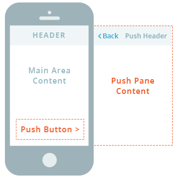
To enable this design, we have added a custom jQuery plugin that enables ‘push panes’, which is contained within jQueryExtras/jQuery.scPush.js. This allows you to store content ‘off-canvas’ until it is requested by a user by clicking on a button.
Push panes are used throughout our application. There are typically used to show additional information about the current page. For example, we might push additional details about a product off of a PDP so that only necessary things (such as item options, price, and action buttons) remain. Accordingly, you should put any necessary information or buttons in a push pane, as this could be confusing to the user and risks disrupting their experience.
Update the View
To implement this feature, you must do so at the view-level. If your view already has push panes on it, you do not need to update the view and can skip to the next section.
First, you must add jQuery.scPush as a dependency to your view.
Second, you must add a line to its showContent() method; if your view does not have one already defined, you must add one like this:
showContent: function showContent () {
    var self = this;
    this.application.getLayout().showContent(this).done(function () {
        self.initPlugins();
    });
}
This creates a listener for when the main layout view has been rendered, which is the perfect time to execute this kind of jQuery code. We then call your view’s initPlugins() method, which you should define as follows:
initPlugins: function initPlugins () {
    this.$el.find('[data-action="pushable"]').scPush();
}
This searches the view’s rendered HTML for elements with the pushable attribute and calls scPush(), which is the initialization method for jQuery.scPush to convert these elements into push panes.
To enable this functionality, you will therefore need to mark up your desired elements in the view’s template.
Note that scPush() can accept an optional object that lets you set a specific device width (based on the application’s media query breakpoints). To do this, pass in {target: 'tablet'} or {target: 'mobile'} to target those specific devices only.
Update the Template
You need to update the template to do two things:
- Create a container to store your off-canvas content
- Create a button to activate the push pane functionality
Both elements must be marked up with special identifier attributes that link the two together, and with attributes that mark them as push pane buttons / content areas.
Here is some example code:
<button class="some-push-button-class" data-type="sc-pusher" data-target="my-push-pane">Read More<i></i></button>

<div class="some-push-pane-class" data-action="pushable" data-id="my-push-pane">
    <p>Lorem ipsum dolor sit amet, consectetur adipiscing elit. Curabitur mattis leo sit amet faucibus euismod. Sed a nunc mi. In at dui vel lectus pharetra tristique. Lorem ipsum dolor sit amet, consectetur adipiscing elit. Duis a pharetra nibh.</p>
</div>
On the button element, note that:
data-type="sc-pusher"is mandatorydata=target="my-push-pane"is mandatory, but themy-push-panevalue can be set to whatever you want, so long as it matches thedata-idvalue on your push pane container
The class names can be whatever you want them to be, as well as the content of the button element itself.
As for the div:
data-action="pushable"is mandatorydata-id="my-push-pane"is mandatory, but themy-push-panevalue can be set to whatever you want, so long as it matches thedata-targetvalue on your push pane button
The class names and the element’s content can be whatever you want it to be. The content can be quite complex, should you need it to be, but keep in mind the nature of the push pane.
Styling
The push pane container has basic styling already, so you may not need to make any further improvements. In some cases it may not be automatically set to be full-width, so you may need to add CSS for that.
As for the button, you may need to, for example, specify that your button’s class extends the base push button class, eg:
.some-push-button-class {
    @extend .push-button-primary;
    margin: $sc-xlarge-margin 0 $sc-large-margin;
    font-weight: $sc-font-weight-semibold;
    position: relative;

    i {
        position: absolute;
        right: 15px;
        top: 50%;
        height: 26px;
        margin-top: -12px;
    }
}
In some cases, for example where you are showing more information, you may want to, instead of showing generic button text, show the start of the information and then curtail it once the value exceeds 100 characters.
We also use them throughout the application in our default themes, so be sure to explore how we use them to get ideas on how you could use them yourself.
Code samples are licensed under the Universal Permissive License (UPL), and may rely on Third-Party Licenses