Hide Content with an Expander
Caution: this content was last updated over 4 years ago
Expanders are UI molecules that hide content from the user until they click on it. When they do, the content slides down as if it were expanding. They are particularly useful in situations when you have additional content not immediately relevant to the user.
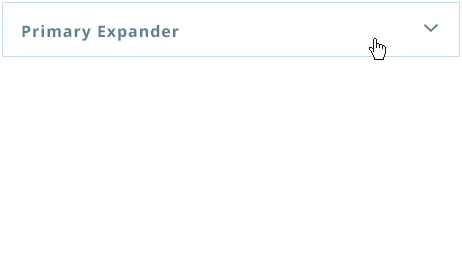
They are similar to push panes, but less jarring in the sense that they do not change the context of the page — the additional information is shown in the current context.
Therefore, expanders are great when you want to showing something, but it is only really supplementary to the current situation. Primary action buttons should probably not be stored in expanders, but auxiliary actions can (we use it for the quick add functionality).
Adding an Expander
The only changes required are to the template and Sass.
First, you should start by creating a container element for your expander. This needs to contain two children: a ‘head’ element, which is what always shows and will trigger the expansion when clicked, and a ‘body’ element which is what shows when the content is expanded. It is fine to use div elements for these.
In the ‘head’ element, add an anchor tag with the following:
class="collapsed"— indicates to the JavaScript that the expander starts collapsed (you will need to add in additional classes for styling later)data-toggle="collapse"— to inform the built-in JavaScript that this is an expanderdata-target="#yourId"— this points the JavaScript to which element should be expanded; note that#yourIdshould be an ID on the ‘body’ element
The anchor tag can then contain the prompt text you always want to show the user.
On the ‘body’ element, add:
class="collapse"— used to track the status of whether it is collapsed, collapsing/expanding, or expandedid="yourId"— this must match thedata-targetvalue on the ‘head’ element (but without the#)data-target="#yourId"— this must match thedata-targetvalue on the ‘head’ element
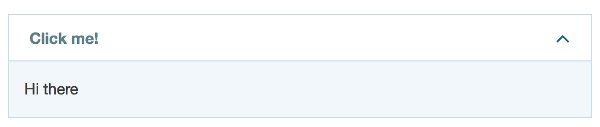
To give you an idea of how this should look, here is an example:
<div class="home-summary-expander-container">
    <div class="home-summary-expander-head">
        <a class="home-summary-expander-head-toggle collapsed" data-toggle="collapse" data-target="#home-summary-body" aria-expanded="false" aria-controls="home-expander">
            Click me! <i data-toggle="tooltip" class="home-summary-expander-tooltip" title="Click this thing" ></i><i class="home-summary-expander-toggle-icon"></i>
        </a>
    </div>
    <div class="home-summary-expander-body collapse" id="home-summary-body">
        <div class="home-summary-expander-container">
            <p>Hi there</p>
        </div>
    </div>
</div>
I included some additional elements and classes for styling, look-and-feel, and accessibility.
For styling, you can extend some built-in styles, eg:
.home-summary-expander-container {
    padding: $sc-base-padding * 3;
    clear:both;
}
.home-summary-expander-head {
    @extend .accordion-head;
}
.home-summary-expander-head-toggle{
    @extend .accordion-head-toggle;
}
.home-summary-expander-toggle-icon{
    @extend .accordion-toggle-icon;
}
.home-summary-expander-body{
    @extend .accordion-body-alt;
}
The result is something like this:
As with a lot of these molecules, refer to our code for examples of where we have used them and how to use them appropriately.
Code samples are licensed under the Universal Permissive License (UPL), and may rely on Third-Party Licenses