Kilimanjaro, Aconcagua, and 2018.2: Developing Your First SuiteCommerce Advanced Customization
Caution: this content was last updated over 6 years ago
This tutorial was written for the Kilimanjaro (2017.2) version of SuiteCommerce Advanced, but it can be used as a useful tutorial for the Aconcagua and 2018.2 versions. For older versions, there are tutorials more appropriate for your version; for newer versions, there have been a few enhancements to architecture and tools that make some of these best practices obsolete.
This tutorial is not appropriate for SuiteCommerce.
This tutorial will teach the very basics of developing a SuiteCommerce Advanced site. To do this, we're going to add new functionality to the account section of your site that allows shoppers to save some preferences. In particular, we're going to look at:
- The languages and frameworks (such as Backbone) that are central to how the code works
- The various key concepts in Backbone and SCA's JavaScript, such as entry point files, views, models, collections, routers, etc
- Services, service controllers, and SuiteScript
- Creating, reading, updating and deleting data
- Custom records
- The configuration tool
- Built-in, re-usable modules, such as modals and confirmation boxes
- Templating with Handlebars
- Styling with Sass
The tutorial will be split into sections roughly along the lines of:
- Understanding the basics of a module and creating a 'hello world' experience
- Upgrading it by creating a service that serves dummy data, learning how Backbone and SCA handle data
- Connecting the module to the backend, to perform HTTP operations on actual data in NetSuite
- Styling and improving the experience of the module
Developers reading this tutorial are expected to ‘code along’ and develop the modules as the tutorial says to. However, the full source for each of the sections (as well as a heavily commented final version) is available in GitHub, under the various versions of UserPreferences.
Part 1: Prepare the File and Folder Structure
To begin, open up your local version of your SCA code into your file editor. Within the Modules folder, you will see a number of other folders:
- extensions — where customizations for your site live
- suitecommerce — where SCA-specific code that NetSuite wrote lives
- third_parties — where the third-party code we rely on lives
Blocks of functionality, called modules, live within these parent folders. To add new functionality, we need to create a new module.
Within the extensions folder, create folders with the following structure:
- UserPreferences\@1.0.0
- JavaScript
- Templates
Module folders take the pattern of <MODULE NAME>@<VERSION NUMBER>. Note that the module name is a namespace, so it must not match the name of any existing module and the version number follows the semantic versioning system.
With the folder structure in place, we need to tell the application where to look for our code within our module. To do this, create a file in UserPreferences called ns.package.json and this in it:
{
  "gulp":
  {
    "javascript": ["JavaScript/*.js"]
  , "templates": ["Templates/*.tpl"]
  }
}
A module's ns.package.json lists all the areas of the module that we want to include when the code compiles. For now we only want to include JavaScript and template files, but later we can add in entries for SuiteScript, Sass and others.
While we've pointed to where the files will live, we next need to point the application to the module itself. To do that, we need to edit the site's distro.json file, which you can find in your root SCA directory.
The distribution (distro) file is a series of JSON objects that list metadata about the site, as well as paths to all the site's modules indicating which ones should be compiled into which application. In particular, look at the modules object near the top: this is where we list all the modules we want to include in our site.
At the top of the modules object, add in the path to our newly created module and the version number, eg:
{
    "name": "SuiteCommerce Advanced Kilimanjaro",
    "version": "2.0",
    "isSCA": true,
    "buildToolsVersion": "1.3.1",
    "folders": {...},
    "modules": {
        "extensions/UserPreferences": "1.0.0",
        "extensions/MyExampleCartExtension1": "1.0.0",
        ...
        "suitecommerce/Account": "2.4.0",
        "suitecommerce/Address": "2.4.3",
        ...
        "third_parties/twitter-typeahead": "0.10.5",
        "third_parties/underscore.js": "1.7.0"
    }
    ...
}
The next part is to specify into which part of the site our new functionality can be used in. An SCA site is divided into three applications: shopping.js (ie browsing and adding to cart), myaccount.js (registering for and accessing personal shopper data), and checkout.js (converting a cart's contents to an order). When you deploy your code, the modules listed as dependencies for each of these applications are compiled into one or more of those JavaScript files.
In this tutorial, our functionality relates to a logged-in shopper who's going to save some preferences against their user record. This, therefore, fits with the notion of accessing personal shopper data, so we need to list our new module as a dependency of myaccount.js.
In distro.json, scroll down through the tasksConfig object until you get to the object that has the key/value pair of "exportFile": "myaccount.js", then add the following to the dependencies object:
"UserPreferences",
After saving, we can move onto writing some code.
Create the Entry Point File
In UserPreferences > JavaScript, create UserPreferences.js. This file is an entry point file: when the module is first loaded, this file is called first.
Its name matches the module folder name, as well as the value we just added to the dependencies object. This is necessary.
Within the file put:
define('UserPreferences'
, []
, function
  ()
{
  'use strict';

  return {
    mountToApp: function ()
    {
      console.log('Hello World! UserPreferences calling!');
    }
  }
});
If you're unfamiliar with the define statement, you should know that this is asynchronous module definition (AMD) functionality, provided to us by a library called requireJS. Using AMD means that our code:
- Performs faster, as we only load modules that we need (and they are loaded separately)
- Is less likely to error, as we can specify which dependencies must be in place before other code can run
- Is neatly segmented into modules, so that it is more logically organized and easier to work with
So to 'define' the module, we use the along with a name, followed by an array of dependencies (none, currently, in our case), and then the code we want the entry point to run. In this file, we're keeping it extremely simple by merely logging a simple statement to the developer console when the module is mounted to the application.
What this one file means is that when the account application is loaded, this module will be too. We can test this by deploying our code up to our site and then visiting the account section of the site.
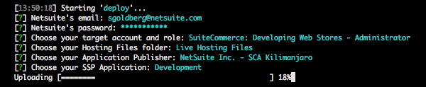
In your command line, change to the working directory of your SCA site and then run:
gulp deploy --no-backup
The --no-backup flag is a time-saving measure when you're rapidly developing and deploying code: normally, after uploading your code, a copy of the original code is made and saved so that you can restore in case things go wrong. I'd certainly recommend making a backup when you deploying a big change to your live site, but for now we needn't bother.
Refer to our Gulp Command Reference for SCA Developer Tools for more information.
If this is your first deploy, then you'll need to complete some prompts to provide the tools with some information about your account. Make sure you push it up to the right account and that you upload the code to the Development (not the Source) directory. After completing them, the values you enter will be saved to your computer — if you need to change them then attach the --to flag to end of the command, which will cause the tools to run through the prompts again.
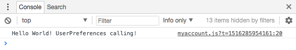
Once it finishes deploying, go to your development site and log into a shopper account. Then, open the developer console and you should see our happy little message!
From here, we can add so more functionality by using the Backbone framework.
Add a Router
A router is a part of the module that deals with URL fragments after the main domain. You create pairings that say "when this fragment is provided, run this function". For example, we're going to allow people to visit /preferences when they're in the account area, so the application needs to know what to do when this happens.
Our module needs routes that allow shoppers to add, view and edit user preference data.
In your JavaScript folder, create UserPreferences.Router.js, and in it put:
define('UserPreferences.Router'
, [
    'Backbone'
  ]
, function
  (
    Backbone
  )
{
  'use strict';

  return Backbone.Router.extend({
    routes:
    {
      'preferences': 'preferencesList'
    , 'preferences/add': 'preferencesAdd'
    , 'preferences/:id': 'preferencesEdit'
    }
  })
});
Just like the entry point file, we start with a define statement. This time, however, we've included a dependency. We list dependencies in an array after we name the current file, using the names that they've been defined with. Then, we pass them, in order, to the function as arguments.
We need Backbone because that is the name of the framework we use to run our applications. Broadly speaking, Backbone lets us split the data and presentation parts of our site up, giving us structure so that we don't get in a tangle around sending data back and forth, connecting parts of the site together, keeping things in sync, etc.
There's a lot more to read up on this, if you're interested, but for now, in practice, it means that we have a lot of ready-made moving parts that we can use throughout our applications to build the site the way we want, in relative ease and structure.
To make use of these parts, after adding them as a dependency, we extend the base classes and add in the bits that are special to our instance. In our example, we take the base router object and then add in the bits that's specific to how our module will function: ie, the routes. The rest of the router functionality is provided by the base version of it, so we don't need to worry about writing it ourselves. Handy!
Finally, the routes object: this where we specify the URL fragments for our module. When a shopper visits <BASE URL>/preferences, the application will call the preferencesList function and run its code. It's important to note that both the route name and callback name are case sensitive; if you camelcase either of them, for example, then you're required to use that style in the rest of your code and the site.
Add a View
However, this is incomplete. When those routes are triggered, the functions they reference can't be called because they don't exist yet. We'll create them in a moment, but first we need to create a view.
Views are the presentation JavaScript of an application. They get data, do something with it, and then render a template. In an application as complex as ours, there isn't a 1:1 connection between a page and views. When a shopper visits a page, it will almost certainly be made up numerous, if not dozens of views. Even within a particular module, you can have one parent view that has numerous child views. In our module, we're going to have a list view that renders a child view for every preference record.
In JavaScript, create UserPreferences.List.View.js and in it put:
define('UserPreferences.List.View'
, [
    'Backbone'
  , 'user_preferences_list.tpl'
  ]
, function
  (
    Backbone
  , user_preferences_list_tpl
  )
{
  'use strict';

  return Backbone.View.extend({
    template: user_preferences_list_tpl

  , getContext: function ()
    {
      return {
        message: 'Hello world! 🌍👋'
      }
    }
  })
});
As well as including Backbone as a dependency, we've now added in a template. This is because views are responsible for the presentation of your site's pages, and will render the template you specify. You'll see that we pass this template the base view class that we're extending.
Along with that, we also have a method called getContext. A view/template's context is an object that contains all of the values that we want to pass from a view to a template. They can be the results of complex functions, data values, or (in our case) simple text messages.
Update the Router
So, we now have something that will render when called. However, we've left our router in complete: we added the routes but not the code to run when the routes are called.
Go back to UserPreferences.Router.js and add in 'UserPreferences.List.View' as a dependency with the name UserPreferencesListView, and then add in the follow code to the return statement:
, initialize: function (application)
  {
    this.application = application
  }

, preferencesList: function ()
  {
    var view = new UserPreferencesListView
    ({
      application: this.application
    })
    view.showContent();
  }
})
The initialize function runs when the file is loaded. We need it because we need to pass through an object called application. This contains a lot of useful values about the state of the application.
The second new function is what runs when the user hits the preferences route. We added our list view as a dependency, and now we're using it in a constructor. We then run the showContent() method, which effectively instructs it to render.
Update the Entry Point File
Our basic router is ready to go (for one route at least), we just need to change the entry point file so that it's called when the module is mounted to the application.
Replace the contents of UserPreferences.js with the following:
define('UserPreferences'
, [
    'UserPreferences.Router'
  ]
, function
  (
    UserPreferencesRouter
  )
{
  'use strict';

  return {
    mountToApp: function (application)
    {
      return new UserPreferencesRouter(application);
    }
  }
});
You'll note that we added our router as a dependency and that we're returning it when the module loads, with the application passed to it.
Add a Template
The final part of this is the template. At the moment, we've got a process going like this:
- Entry point file loads when the account application loads
- Router loads when the entry point file loads
- View loads when the router loads
- Template will load when the view loads
In the Templates folder, create user_preferences_list.tpl with the following:
<h1>{{message}}</h1>
The templating system is provided by the Handlebars framework. It accepts normal HTML but also allows for values to to be passed to it when rendered, as well as perform some basic functions like conditional statements and blocks. We'll look at more complex uses of Handlebars later.
In our case, we're passing a context object to the template and in it is our message. It can be referenced by using {{message}} in our template.
Test (Locally)
The barebones of the module is now complete and will work if we deploy it. However, you've probably noticed that uploading takes a couple of minutes, even without the backup running.
As part of the developer tools, we offer a local development environment where changes to your site's JavaScript, HTML and CSS can be updated in near-realtime. It effectively runs a server from your computer, with these resources served locally rather than from NetSuite (note, however, that calls for data, such as those through SuiteScript, are still served from NetSuite servers).
To start the local server, run the following command in your CLI:
gulp local
Once the task has finished running, Gulp will watch your files for any changes. If it notices any, it will re-run any compilation job to produce the new compiled files; just note that some jobs take longer to run and your changes won't take effect until they've finished.
To access the local version of your site, you'll need to use a 'local version' of your site's URL, like this:
// Pattern
https://<DOMAIN>/c.<COMPANY>/<SSP>/<APPLICATION>-local.ssp?n=<SITE>

// Example
https://checkout.netsuite.com/c.TSTDRV12345678/sca-dev-kilimanjaro/my_account-local.ssp?n=3
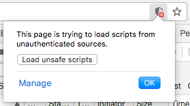
If you don't have an active session to a logged-in part of your site then you'll be asked to log in again. However, note two things:
- You will need to edit the URL again to change my_account.ssp to my_account-local.ssp
- You may get entirely white screen, like nothing has loaded
With the second one, you will need to give your browser permission to run unsafe scripts. The scripts we're running aren't actually unsafe, rather they're being run locally which the browser isn't expecting and is unsure whether they're safe.
In Google Chrome, this'll be represented by a shield at the end of the address bar that you can click and OK it:
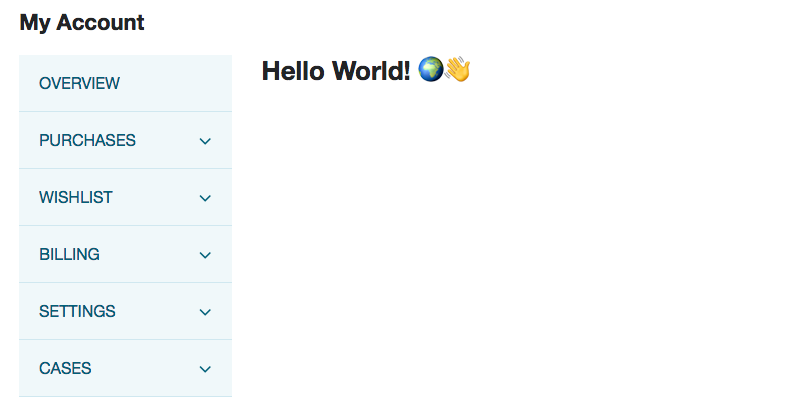
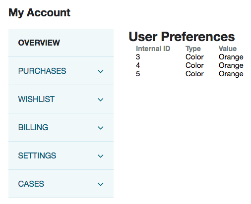
When the page reloads, your shopper's account homepage will be shown. In the address bar, add #preferences to the end of the URL — this will trigger the route we set up. The page should navigate away and you should see something like this:
Part 2: Data Basics with Dummy Data
In the first part of this tutorial, we did the basics of new module development: created a module with an entry point, router, view and template, and had it render a simple message when we visited a particular URL path on our site.
This part of the tutorial will build on the foundations of that by:
- Creating a service controller and backend model to simulate HTTP requests for data
- Creating a chain from the NetSuite servers to the frontend template of the site, so the data can flow
- Adding a frontend model to handle data, and adding a collection to handle the models
There's a few interstitial steps too, but that's the gist.
Add a Backend Model
Your site has data stored in NetSuite and you want to get it into your JavaScript so that you can serve it to your shoppers. You also may want to save data that the shopper submits. These are all things that you can do with SuiteScript, our proprietary scripting language.
SuiteScript is based on JavaScript, but it can only run on NetSuite servers. This means that when you write some SuiteScript for your site, you have to upload changes to NetSuite so that it can run on the servers. There are two key features to this:
- It gains privileged access to record data objects and methods
- The scripts are obscured from the user, which can be good for security or privacy (eg to hide proprietary code or API keys)
In Backbone, models are there to handle data. They define what to do when each method is called. We're going to write a SuiteScript model that simulates getting data from NetSuite, so that file is going to say, "when I'm told to get data, I'm going to return an object of data".
Specifically in SCA, we have backend and frontend models. When it comes to customization to fit your module's needs, you will typically only need to make change to your backend model — the base frontend model class only requires the path to your backend model.
To begin, create a folder called SuiteScript in UserPreferences, and in it create a file called UserPreferences.Model.js.
In that file, put the following:
define('UserPreferences.Model'
, [
'SC.Model'
]
, function
(
SCModel
)
{
'use strict';
return SCModel.extend({
name: 'UserPreferences'
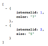
, list: function ()
{
return [
{internalid: 1, type: 'Color', value: '7'}
, {internalid: 2, type: 'Size', value: '5'}
]
}
})
});
We define the file as normal, but this time we include SC.Model which is our base class for backend models. After extending it, you'll note that we give it a name — this'll be used to register it within the application and be a name to which we can refer.
Then we have a list method: note that in models, we don't have to match 1:1 HTTP method names to the methods in our model. So, we can create a method that lists all record data at once; the call to this method will be made in the service (controller) that we'll get to later.
You'll note that when it's called, it'll just return an array of hardcoded data objects, but that's fine for now. So, how do we call it?
Add a Service Controller
A backend model is only half of what we need: the other is a service controller.
As the name suggests, it controls services. What's a service? It is a NetSuite term to describe a SuiteScript file that handles the typical HTTP/CRUD (create, read, update, delete) methods associated with a website and its associated data. In older versions (ie those before Vinson), you had to manually code your own service file. However, modern versions use service controllers instead.
Service controllers allowed us to standardize so much of the service as the files were frequently so similar to each other. They also offer a lot of other useful things such as permission validation, events and extensibility, AMD, and more.
For now, however, what we need to know is that the connect with the backend model and then compile to form the service file. In other words, we haven't got rid of service files, instead we've just implemented a system that can automatically generate them based on how we define the service controller.
In SuiteScript, create UserPreferences.ServiceController.js and in it put:
define('UserPreferences.ServiceController'
, [
    'ServiceController'
  , 'UserPreferences.Model'
  ]
, function
  (
    ServiceController
  , UserPreferencesModel
  )
{
  'use strict';

  return ServiceController.extend({
    name: 'UserPreferences.ServiceController'

  , get: function ()
    {
      var id = this.request.getParameter('internalid');
      return id ? UserPreferencesModel.get(id) : UserPreferencesModel.list()
    }
  })
});
The two dependencies for this are the base service controller that we're going to extend, and the backend model we just created.
The service controller's methods must match the following names: get, update, create, remove, which correspond respectively to read, update, create and delete. So, therefore, when a call from the frontend is made to get a record or some records, the get method, specifically, is called. However, as you'll see from the code, how we handle this (ie what we code we write) is up to us.
Internal IDs are assigned to every record in NetSuite — they are numerical (starting from 1) in the context of the type of the record they are. Thus, when we create a custom record, the first one we create will have the internal ID of 1, despite there being other records of other types that have an ID of 1.
In our module's functionality, we anticipate two kinds of get request:
- Load a specific record's data (aka a detailed view)
- Load all records (aka a list view)
So how do we differentiate between a request for a detailed view of a record, and a request for all records? In our get method, we have two lines of code that handles this request. The first sets a variable plucking the ID from the request. Imagine looking at a list of a records and clicking a View button next to one: the clicking of the button is saying "show me more about this record"; in technical terms, that means we will have to provide a record ID. However, if we've just loaded a landing page for records, then no specific ID will be request and the parameter for the internal ID will be left blank.
This brings us to the second line of code: what it's saying is, if there's an ID in the request then run the get method on the model; if there isn't, then you run the list method.
Deploy and Test the Service
We'll add some more methods later, but for now we need to think about how we're going to make the application aware of our SuiteScript. The first part, if you remember, is to update the module's package file.
Open ns.package.json and in it add the following to the gulp object:
, "ssp-libraries": ["SuiteScript/*.js"]
, "autogenerated-services": {"UserPreferences.Service.ss": "UserPreferences.ServiceController"}
We're pointing to our new SuiteScript, which compiles into ssp_libraries.js, and then the service controller that will be used to generate our service file.
We also need to update our distro file. Like our JavaScript, we also need to tell the tools to compile the code into the right places.
Open distro.json and find the ssp-libraries object. In the dependencies array, add "UserPreferences.ServiceController".
Don't forget to put a comma on the previous line.
And that's kinda it for the backend stuff: we've joined those two bits together, and made our application aware of them, so after deploying it we can test it out.
gulp deploy --no-backup
You can actually access services directly in your browser. For something that is a simple get request, you can just put the service URL into your web browser and it'll run the method, for example:
// Pattern
https://<BASE URL>/<SSP>/services/UserPreferences.Service.ss?n=<SITE>

// Example
https://checkout.netsuite.com/c.TSTDRV12345678/sca-dev-kilimanjaro/services/UserPreferences.Service.ss?n=3
If you don't have an active, logged-in user session then you'll get a permissions error. However, if you are logged in then you should see this:
Great! That means the constituent parts of the service — the model and service controller — are functioning. That means we can now move on to the frontend aspect of this module.
Create the Collection
We know that data can be requested from the server, but now we need to write code to do it for us, as well as add some new files to handle this data: this is where we add another model and a collection.
We also know that the model is what handles the data, but you might not know what a collection is. In short, a collection is a group of models — specifically, it is the same model, iterated multiple times for records of the same type. We use collections when the data we're expecting back is an array (collection) of records, rather than a single record.
In our example we need one because we're going to call a list method, and a list will return some details about every record in that list.
In JavaScript, create UserPreferences.Collection.js and in it put:
define('UserPreferences.Collection'
, [
    'Backbone'
  , 'UserPreferences.Model'
  , 'underscore'
  ]
, function
  (
    Backbone
  , UserPreferencesModel
  , _
  )
{
  'use strict';

  return Backbone.Collection.extend({
    model: UserPreferencesModel
  , url: _.getAbsoluteUrl('services/UserPreferences.Service.ss')
  });
});
Relatively speaking, it's quite a simple file; we extend a base collection class and then do two things:
- Specify the model to use
- Point to the service where the data will come from / go to
Firstly, note that we haven't created this model yet — despite it having the same name as the backend model, the above refers to the frontend model. Remember, the backend model is uploaded to the server and handles the data at that part of the interaction; the frontend model is what handles it on the user's end. We'll create this soon.
Secondly, the url key has a relative URL that we're transforming into an absolute one using _.getAbsoluteUrl. We haven't really talked about Underscore yet, but it's worth doing so.
Underscore is a library — a very useful library — that runs right through our application. It has a number of methods that make tedious things very easy. Furthermore, because of it's multifacetedness, we use its namespace (_) for our own utility functions too. One of those functions is getAbsoluteUrl, which, as I said, is used to create links for resources such as services.
For more information on Underscore, read their documentation.
Create the Model
As mentioned, our functionality needs a collection because we're going to be offering list functionality for our records. The collection takes the data and then pumps out a frontend model for each one.
Let's create that model now.
In JavaScript, create UserPreferences.Model.js:
define('UserPreferences.Model'
, [
    'Backbone'
  , 'underscore'
  ]
, function
  (
    Backbone
  , _
  )
{
  'use strict';

  return Backbone.Model.extend({
    urlRoot: _.getAbsoluteUrl('services/UserPreferences.Service.ss')
  });
});
Again, very simple looking. We point to the service again (note that the key name is a little different) and that's basically it. The base model code does the rest of the work for us.
Update the Router
The model and collection are ready to be used, so now we need to plug them into our application. To do this, we need to do three things:
- Add the collection as a dependency of the router
- Instantiate a new collection object when the list function is called
- Fetch the data, and then — when this is complete — render the view
Thus, open up UserPreferences.Router.js and update the opening of the define statement:
define('UserPreferences.Router'
, [
    'Backbone'
  , 'UserPreferences.List.View'
  , 'UserPreferences.Collection'
  ]
, function
  (
    Backbone
  , UserPreferencesListView
  , UserPreferencesCollection
  )
{
Then, change the preferencesList method to this:
, preferencesList: function ()
  {
    var collection = new UserPreferencesCollection();
    var view = new UserPreferencesListView
    ({
      application: this.application
    , collection: collection
    });

    collection.fetch().done(function ()
    {
      view.showContent();
    });
  }
You can see that we're returning a new collection, and then calling the fetch method — this is built into the base collection class and calls the URL we specified in our extended collection. Then, when that's done, we tell the view to show its content (although, at this point, it's not sent any of the collection's data). We're also, as you'll note, passing the collection to the view.
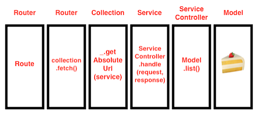
This all means that there is a connection from the frontend to the backend.
- The
preferencesroute is called by the visitor, triggering thepreferencesListfunction - The function calls the
fetchmethod on the collection - The collection triggers a call to the service via the URL
- The service calls the service controller
- The service controller calls the
getmethod on the backend model - The backend model returns our dummy data
Or, in visual terms:
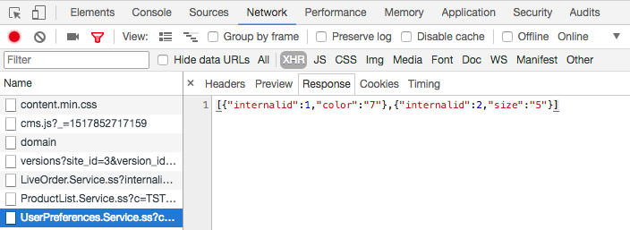
We can actually test this; our data won't show up in the page, but we can inspect the call in our developer tools.
Restart your local server — you need to stop and start it when you add new files — then open your dev tools and log in to the account section of your site again. Edit the URL go to the local version of your SSP, and then replace the end with #preferences.
You should see your normal 'hello world', but if you open up the Network tab of your tools and look in the XHR subtab, you should see a call to your service — click on it. The Response subtab should show you the data we put in our model!
Now, let's plug this data into view and template.
Add a Collection View as a Child View
As we said, a collection is a tool for showing a compilation of records of the same of the type; in SCA this is usually an array of objects. The list view acts like a container for when the route is called, but it does not render the data itself — for this we need a collection view (as we're using a collection).
An easy way to think about this, in terms of your data, is an HTML table. When we want to render a table, there are two elements:
- The
tableelement and the headings that make up the structure and context of the table - The body and rows of a table, the ones that contain the data
Thus, the collection view is the first one — the structure — and the second one is the soon-to-be-created details view, which will contain the individual data models.
To add a collection view to render the collection, you have to add it as a child view to another view — in our case, this is the list view.
A child view is simply a view that renders within the context of another view. The template of the parent view is marked up so that you can determine exactly where you want the child view to render. Thus, in our case, we're going to build up the structure of the table in the parent template and then mark up the body element with a special data attribute to show where we want the rows to render.
Open UserPreferences.List.View.js and add two new dependencies:
Backbone.CollectionViewasCollectionViewUserPreferences.Details.ViewasUserPreferencesDetailsView
Then add the following method:
, initialize: function (options)
  {
    this.application = options.application
  , this.collection = options.collection
  }
Remember how we updated the router to pass through the application and collection when we run the list view constructor? This is where we apply them. As mentioned in the last part, the initialize method runs when the file is loaded: the options argument is all the stuff that's passed during construction.
Now add another new method:
, childViews:
  {
    'UserPreferences.Collection': function ()
    {
      return new CollectionView({
        'childView': UserPreferencesDetailsView
      , 'collection': this.collection
      , 'viewsPerRow': 1
      })
    }
  }
The childViews method is a standard method for what are known as composite views; these are views that have children, ie, they are composed of more than view. As of the Elbrus release, all views are now composite views — previously you had to add a dependency every time you wanted to turn a view into a composite view; since then we have rolled this functionality into all views.
This method accepts lists of objects to render as child views. In our case, we are adding only one but you can see that we:
- Name it
- Construct it using the base collection view
- Pass it a number of customization values, such as the view to use (our details view), the collection data to use and then how many views per row (for basic things, set this to 1)
Let's take a look at the details view now.
Create a Details View
The collection view has been told to render a specific child view for each data object (model) in the collection.
There are two important parts to a details view:
- The context object, where we have to specify all the individual values that we want to pass to the template
- The template we want to render
In JavaScript, create UserPreferences.Details.View.js and add to it:
define('UserPreferences.Details.View'
, [
    'Backbone'
  , 'user_preferences_details.tpl'
  ]
, function
  (
    Backbone
  , user_preferences_details_tpl
  )
{
  'use strict';

  return Backbone.View.extend({
    template: user_preferences_details_tpl

  , getContext: function ()
    {
      return {
        'internalid': this.model.get('internalid')
      , 'type': this.model.get('type')
      , 'value': this.model.get('value')
      }
    }
  })
});
When instantiated, the details view will be passed a model of the data it's being asked to render; from this, we can pluck out the values that we want and add them to the template context. Here, you can see that we're pulling out the three values that we expect to find in the objects.
Let's set up templates to render the collection and the details.
Update the List Template
We'll start with the list template. This will contain the structure for the table.
It's currently set up to display the 'hello world' message, so replace its contents with the following:
<h1>{{translate 'User Preferences'}}</h1>
<table>
    <thead>
      <tr>
          <th>{{translate 'Internal ID'}}</th>
          <th>{{translate 'Type'}}</th>
          <th>{{translate 'Value'}}</th>
      </tr>
    </thead>
    <tbody data-view="UserPreferences.Collection"></tbody>
</table>
OK, so I'm introducing two new things here.
The first is the {{translate}} helper. SuiteCommerce sites support multiple languages and it works by keeping dictionaries of base strings and their translated values. Using this helper, you pass it the string you want to use and it looks up a translation in the user's selected language; if one is found then it is returned, otherwise the original string is used instead. Thus, if you're not using multiple languages, you don't have to do this: you can just put plain text into your templates, but we consider it good practice to do this anyway (in case you plan to go multilang in the future).
An alternative to this would be to set all the strings in the view (using _.translate()) and pass them to the template like we did with our 'hello world' message.
The second is the tbody element that has the data-view attribute on it. You'll notice that it's the same as the name we used in the list view's childViews method. We're essentially saying "render the collection child view here" and pointing at this element.
Create a Details Template
Finally, let's determine how we want the template for each individual table row to look.
In Templates, create user_preferences_details.tpl and in it put:
<tr>
    <td>{{internalid}}</td>
    <td>{{type}}</td>
    <td>{{value}}</td>
</tr>
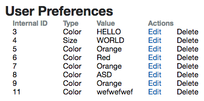
Yup, all it is is a table row with three cells, populated with values from the view context. This'll repeat each time it's called, depending on the data in the collection.
Test and Tidy Up
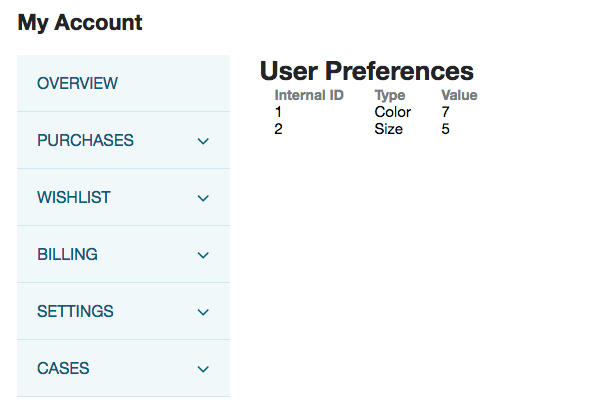
That's it! If you kill and restart your local server and go through the process of logging in and then revisiting the local version of your account page, you should see something like this:
Great!
All that's left now is some tidying up. We no longer need the 'hello world' message in the list view's context; so, in UserPreferences.List.View.js, remove the entire getContext method.
You can save and do a full deploy if you like.
Part 3: Connect to the Backend and Use Real Data
In this part, we're going to use expand to use real data, as well as implement the full complement of HTTP/CRUD functions so that the user can create, read, update and delete their personal preferences.
Custom Record Type
Within NetSuite, we have a lot of records — they're the things the hold data. As part of our offering we have a lot of built-in 'standard' record types, things like sales orders and inventory items. However, the platform also allows you to create your own types — and that's what we're going to do with our functionality. We want to record user preferences, so we're going to need to create a custom record type with custom fields to capture them.
In NetSuite, go to Customization > Lists, Records, & Fields > Record Types > New and then set it up as follows:
- Label: User Preferences
- ID: _user_preferences
- Include Name Field: (unchecked)
- Access Type: Use Permission List
- Show ID: (checked)
- Permissions Tab:
- Role: Customer Center
- Level: Full
- Restrict: Viewing and Editing
Make sure you click Add in the Permissions tab to add that permission to the table, and then click Save to add the record type. Leave all other settings on their default values.
So we've just created a new record type. Some important things to note before we move on: first, the ID starts with an underscore. In NetSuite, all custom things you create will be automatically prefixed with a standard name depending on what type it is. In our example, customrecord will be prefixed, resulting in our record having the reference of customrecord_user_preferences — hence the underscore before the name.
Next, the permissions are set up so that customers will be able to read, edit and delete only the records they own.
After saving, the page reloads and the Fields tab should now be visible. We're now going to create the fields we need to store data in.
For each of these, click New Field to start:
- Label: Owner
- ID: _user_preferences_owner
- Type: List/Record
- List/Record: Customer
- Validation & Defaulting Tab:
- Mandatory: (checked)
This one will be used to store the ID of the user who created it. This is how we'll know what records the shopper can access.
- Label: Type
- ID: _user_preferences_type
- Type: List/Record
- List/Record: New
- Name: Type
- ID: _user_preferences_type
- Values: Color, Size
- Validation & Defaulting Tab:
- Mandatory: (checked)
This'll be used to store the type of preference. We're creating a custom list for this because we want to limit the values that the user enters. In other words, we're going to create a dropdown from which users can select the value they want.
- Label: Value
- ID: _user_preferences_value
- Type: Free-Form Text
- Validation & Defaulting Tab:
- Mandatory: (checked)
Allowing users to set their preferred size or color as a string rather than from pre-determined list is a little sub-optimal. After all, we just said we want to limit the user's inputs, but to be perfectly honest it would complicate things quite significantly, detouring us from the purpose of this tutorial. So, yes, therefore, we are going to stick with free-form text.
Creating Records
So the first thing we can learn is the process for adding new records. The code we're going to write is SuiteScript: this is the proprietary scripting language that only runs on NetSuite servers. There are multiple facets to SuiteScript, and a lot of nuances to learn, so I'm going to ignore all of them to just focus on the stuff we need for this module.
In SuiteScript, there are three parts to creating a new record:
- Specifying what type of record you want to create
- Setting the field values
- Submitting the record
If you think about it, this process is mirrored in the backend UI too.
Add a New Method to the Backend Model
In SuiteScript > UserPreferences.Model.js, add the following method:
, create: function (data)
  {
    var newRecord = nlapiCreateRecord('customrecord_user_preferences');

    newRecord.setFieldValue('custrecord_user_preferences_owner', nlapiGetUser());
    newRecord.setFieldValue('custrecord_user_preferences_type', data.type);
    newRecord.setFieldValue('custrecord_user_preferences_value', data.value);

    return nlapiSubmitRecord(newRecord);
  }
As we've alluded already, talking to NetSuite via our APIs involves sending and receiving data in JSON; creating records via SuiteScript is no different.
We start with nlapiCreateRecord, which doesn't actually 'create' the record per se; rather it readies the creation of a new record, kinda like asking for a form so that you can fill it in.
The next part is filling it in, ie, setting the field values. The first — the owner — can be determined automatically by using nlapiGetUser(); this is a method that returns the ID for the current user, and is vital for accurately ascertaining ownership throughout the system.
The rest of the fields will be determined by what's passed to the create method via the data argument. You'll note that we use the method setFieldValue — this is standard and must be used when creating new records.
The final part is the nlapiSubmitRecord call, which has the completed record object passed to it. This'll create a new user preferences record with the owner and user's values set.
But, of course, this won't do anything just yet because it's not connected to the frontend. So now, we need to connect it to the service controller, so it knows to call it when a POST HTTP call is made.
Add a New Method to the Service Controller
We need to call the create method in the model when asked to; but how does the system get asked in the first place? By adding a post method to the service controller.
In UserPreferences.ServiceController.js, add the following method:
, post: function()
  {
    this.sendContent(UserPreferencesModel.create(this.data), {'status': 201});
  }
The sendContent method is a part of the application which sends data to the servers; so what we're saying is, "Send content to the server using the create method of the UserPreferences model, with this data. Afterwards, return the 'created' HTTP code." This is all done with the right headers and content type, so you don't have to worry about that.
Next we need to call this method from the frontend.
Update the Router
Remember, we called the GET method by hitting a route on the frontend. For submitting (and updating and deleting) record data, the story is the same: we just need new routes and functions in our router.
For now, we're going to test this works by submitting dummy data — we'll build an actual form to submit user data later.
Open up UserPreferences.Router.js and add a new dependency: UserPreferences.Model as UserPreferencesModel.
Then, add a new method:
, preferencesAdd: function ()
  {
    var model = new UserPreferencesModel();

    model.set('type', 1);
    model.set('value', 'Orange');

    model.save();
  }
We already added a route for this function. So, when a user visits preferences/add, it'll be called. It'll create a new model and add some dummy data to it, and then it'll run its save method. This method is built into Backbone and our application to trigger the service specified in the model we specified.
We can now do some testing. Do a deploy of the code up to your site. When it's done, log into the dummy account on the frontend and navigate to #preferences/add. You should see a completely white page but — and here's the important thing — if you check the UserPreferences.Services.ss call in the Network tab, you should see the call being made. The Request Payload in the Headers tab should show you the data being sent, and, in the Response section, an integer — this is the server returning the internal ID for the newly created record! You can hit refresh a few times to create new a record each time.
To check it, log into the backend of your site and go to Customization > Lists, Records, & Fields > Records. Click List in the User Preferences, row click List see your freshly created records!
Listing Records
Now that we have the records in the system, we can look at pulling them out and displaying; ie, perform a proper GET request.
To get the data we want from NetSuite, we need to perform a record search, which is performed by running nlapiSearchRecord in a backend file. It is a method that accepts four arguments:
- type: the internal ID of the record type we want to perform a search on
- id: the internal ID of the saved search (we're not using a saved search, so we can ignore this)
- filters: an object or array of objects that reduce down the number of results returned (eg, we're going to specify an owner so we only get the records the current user owns)
- columns: an object or array of objects specifying which parts (ie fields) of the returned records we want
As we're dealing with arrays of objects, it's generally a good idea to build these up as variables before performing the search. Thus, in SuiteScript > UserPreferences.Model.js, replace the list method with this:
, list: function ()
  {
    var type = 'customrecord_user_preferences';

    var filters = [
      new nlobjSearchFilter('custrecord_user_preferences_owner', null, 'anyof', nlapiGetUser())
    ];

    var columns = [
      new nlobjSearchColumn('internalid')
    , new nlobjSearchColumn('custrecord_user_preferences_type')
    , new nlobjSearchColumn('custrecord_user_preferences_value')
    ];

    var search = nlapiSearchRecord(type, null, filters, columns);

    return _.map(search, function (result) {
      return {
        internalid: result.getValue('internalid')
      , type: result.getText('custrecord_user_preferences_type')
      , value: result.getValue('custrecord_user_preferences_value')
      };
    });
  }
The id is pretty self-explanatory: we specify the types of records we want.
With the filters, we create a NetSuite object using nlobjSearchFilter, which has five parameters:
- name: the internal ID of the filter (eg the field name)
- join: the internal ID of the joined search where this filter is defined (we're not using it, so it's null)
- operator: the operator name we're using to do with the filtering (eg
anyOf,contains,lessThan) — this is the type of matching we want with the values provided for filtering (for lists and records, we have to useanyofornoneof) - value: the value you're filtering by
- value2: an optional second value that we're not using
After that, we have the columns. These represent the field data we want returned our search. For these we construct a different NetSuite object called nlobjSearchColumn, supplying the IDs of the fields we want. (Fun fact: nlobjSearchFilter and nlobjSearchColumn are the only two objects that can be constructed — all other objects can only be created via top-level function or method calls.)
The final thing to do is perform the search, with nlapiSearchRecord and newly created variables. A key thing to note here is that we assign it a variable too: this makes it much easier to manipulate once the data comes back — if we didn't do this, every time we did something we'd end up making another call to the API, which is pointless, time-consuming and resource-consuming.
So what it's saying is, "Perform a search on user preferences records, filtering for ones that the current user owns, returning to me only the internal ID, type (ie color or size) and value of that type (eg orange)".
Once we have those records, we create an array out of the results using _.map. It is useful because it takes the array results and then creates a new, more usable one, based on the transformations we provide it. In our case, we're creating a simple array of objects where each one contains the internal ID, type and value.
One important thing to note here is that for internalid and value, we're using the getValue method but when it comes to type, we're using getText. If we used getValue instead, we'd get the internal ID of the value in the select (dropdown) field instead, which isn't user friendly. In other words, this way we get back the string Color rather than the integer 1 (which is its internal ID).
Great! Now if you deploy up to NetSuite and then refresh the #preferences page, you should see your records returned!
A Form for Creating New Records
At the moment, new records are created using dummy data every time a particular page is hit. This, obviously, isn't how we want our functionality to work. Instead, we want to have a form that the user can fill out and then submit.
Add an Edit View
In JavaScript, create UserPreferences.Edit.View.js and in it put:
define('UserPreferences.Edit.View'
, [
    'Backbone'
  , 'Backbone.FormView'
  , 'underscore'
  , 'user_preferences_edit.tpl'
  ]
, function
  (
    Backbone
  , FormView
  , _
  , user_preferences_edit_tpl
  )
{
  'use strict';

  return Backbone.View.extend({
    template: user_preferences_edit_tpl

  , events:
    {
      'submit form': 'saveForm'
    }

  , initialize: function (options)
    {
      this.model = options.model;
      this.application = options.application;
      FormView.add(this);
    }

  , typeOptions: function ()
    {
      var options = [
        {internalid: 1, name: _.translate('Color'), isSelected: (this.model.get('type') == 'Color')}
      , {internalid: 2, name: _.translate('Size'), isSelected: (this.model.get('type') == 'Size')}
      ]

      return options
    }

  , getContext: function ()
    {
      return {
        typeOptions: this.typeOptions()
      }
    }
  })
});
This looks like a regular view except we're using two new things: a form view and events.
The form view is a view we created to standardize the forms we use across SCA. Essentially, it does all the heavy lifting in regards to connecting the form to the application: all you have to do is plug it in and switch it on. After adding it as a dependency, all we need to do is add a call in the initialize method.
Next, is the events object. This is available in views and allow you to create listeners following the "event selector": "callback" pattern provided by the jQuery.on() method.
In our view, we're adding a listener for when a submit button is pressed within in a form element. When it's triggered, it will run the saveForm function, which is attached to the form view. Essentially, this is what will transfer the data along the chain up to NetSuite.
For more information on events, take a look at how to get to grip with events, in particular Backbone events.
The rest of the file is dedicated to the type options for the select/dropdown element. We need to send these to the template so that we can generate the dropdown's options. Note that I've used the same internal ID and names as the backend values.
Also note that I've done an awful thing of comparing the value of text strings to see which one should be marked as 'selected' in our template. Obviously don't do that in your code, but like I said earlier, this bit would normally be done a different way. So let's gloss over it.
Add an Edit Template
We mentioned a new template in our view, so let's create it now.
In Templates, create user_preferences_edit.tpl with:
<h1>{{translate 'Add/Update User Preference'}}</h1>
<form>
    <fieldset>
        <label>{{translate 'Type'}}</label>
        <select name="type" id="type">
            {{#each typeOptions}}
                <option {{#if isSelected}}selected{{/if}} >{{name}}</option>
            {{/each}}
        </select>

        <label>{{translate 'Value'}}</label>
        <input type="text" name="value" id="value" value="{{value}}">
    </fieldset>
    <button type="submit">{{translate 'Add/Update'}}</button>
</form>
A standard, simple form with an interesting Handlebars helper: {{#each}}. This is a simple block that iterates over every item in the list and does something. In our case, we want to produce an option for the dropdown where the internal ID is the value and the name is the text that's displayed.
Update the Router
Finally, we need to trigger the view to load when the route is called.
In UserPreferences.Router.js, add UserPreferences.Edit.View as a dependency (as UserPreferencesEditView), and then replace the preferencesAdd method with:
, preferencesAdd: function ()
  {
    var model = new UserPreferencesModel();
    var view = new UserPreferencesEditView
    ({
      model: model
    , application: this.application
    })

    view.showContent();
  }
This looks similar to the list route below it, so you should be familiar with the pattern: we ready the model (not a collection, because we're only dealing with one record, remember), ready the view, and then call showContent(), which will render it (and thus the template!).
Stop and start your local server and visit #preferences/add. When it loads, you should see a form like this:
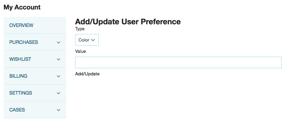
Complete it with some dummy data, eg with the color red, and hit the Add/Update button. You won't get a confirmation message (yet) that it's gone through but you can check the request payload of the service in the Network tab to see that it's sending data; and you can check the response from the server, which will be the internal ID of your newly created record.
You can also return to the list page and see your newly created records in the list!
Get Individual Records
So, we can create records and read them as part of a list, but what about viewing them individually? Well, we're on the road to updating record data and we can actually use a lot of the similar code.
Add a Get Method to the Backend Model
Before we can update records, we first need to be able to view them directly.
Open SuiteScript > UserPreferences.Model.js and add:
, get: function (id)
  {
    var type = 'customrecord_user_preferences';

    var filters = [
      new nlobjSearchFilter('custrecord_user_preferences_owner', null, 'anyof', nlapiGetUser())
    , new nlobjSearchFilter('internalid', null, 'is', id)
    ];

    var columns = [
      new nlobjSearchColumn('internalid')
    , new nlobjSearchColumn('custrecord_user_preferences_type')
    , new nlobjSearchColumn('custrecord_user_preferences_value')
    ];

    var search = nlapiSearchRecord(type, null, filters, columns);

    if (search && search.length === 1)
    {
      return {
        internalid: search[0].getValue('internalid')
      , type: search[0].getText('custrecord_user_preferences_type')
      , value: search[0].getValue('custrecord_user_preferences_value')
      }
    }
  }
The first thing you'll note is that it is very similar to the list method — and why wouldn't it? They're effectively doing the same thing. However, the crucial differences are:
- Getting a single record rather than a list, requires/allows us to look up a record using its internal ID, which we specify as a filter
- Rather than map the results (ie produce an array of objects), we return a simple object of the fields we want
Now, we already have the code in our service controller to handle this, so we can move on.
Update the Router with an Edit Route
Back in UserPreferences.Router.js, you'll see that we already added a route for when a user visits #preferences/:id, so now we need to add the function to support this.
Add a new method:
, preferencesEdit: function (id)
  {
    var model = new UserPreferencesModel();
    var promise = jQuery.Deferred();
    var application = this.application;

    if (!id) {promise.resolve()}
    else
    {
      model.fetch({data: {internalid: id}})
      .done(function () {promise.resolve();});
    }

    promise.done(function ()
    {
      var view = new UserPreferencesEditView
      ({
        application: application
      , model: model
      });

      view.showContent();
      view.model.on('sync', function (model)
      {
        Backbone.history.navigate('preferences', {trigger: true});
      });
    });
  }
This is similar to the preferencesAdd method; in fact it's so similar, I want you to delete the preferencesAdd method, and update the routes object so that the preferences/add route points to preferencesEdit.
Now you've done that, we can look at the new code.
We're using promises, or, more specifically, jQuery's deferred objects. Now, there's a lot to learn about these, if you’re interested, but let me tell you the crucial stuff. When you do something like make an API call, you want code to run depending on the result of that call. Now, you could write a series of complicated callbacks that checks the status (while you wait) and then does stuff, or you can use a deferred object.
Essentially you create a placeholder, and then attach handlers to it. In our example, we want to see if an internal ID has been provided: if it has then we want to fetch the data of that ID; if it hasn't, then we can skip that step. In either case, we then render the view and then set up a listener so that whenever a model is synced with the server, we trigger a redirect to the list page.
Got it?
OK, so the deferred objects come in to play with the promise.resolve and promise.done bits. Running .resolve() executes the code in the .done() function — and in our conditional statement, both cases will run it. However, in the case of an ID being provided, we run a fetch on the data based on the internal ID first.
The code works because, just like before, if there's no data, then all we need is to ready an empty model. However, if there is data, then we can just send it to the view so it can be used in our template.
Add the Data to the Edit View
We've called the data, now we need to send it to the view (and then on to the template).
As the data will already be passed to the view, now we just need to add it to the context object so the template can get at it.
Update the getContext method:
, getContext: function ()
  {
    return {
      typeOptions: this.typeOptions()
    , type: this.model.get('type')
    , value: this.model.get('value')
    }
  }
Now, we already coded the template to handle this data. If you remember, our inputs are already marked up with code like value="{{type}}", which means that when we view the form and it's associated with an existing record, then the fields will be pre-populated when they load.
Update Individual Records
OK, nearly there.
Add an Update Method to the Backend Model
Head back to the SuiteScript > UserPreferences.Model.js and add a new method:
, update: function (id, data)
  {
    var record = nlapiLoadRecord('customrecord_user_preferences', id);

    record.setFieldValue('custrecord_user_preferences_type', data.type);
    record.setFieldValue('custrecord_user_preferences_value', data.value);

    return nlapiSubmitRecord(record);
  }
});
nlapiLoadRecord takes the type and ID of a record and gets its data. Then all we all need to do is set the field values and then submit it back to the system. Easy.
Add a Put Method to the Service Controller
So now we connect the backend model to the service controller. For this, open up UserPreferences.ServiceController.js and in it put:
, put: function ()
  {
    var id = this.request.getParameter('internalid');
    UserPreferencesModel.update(id, this.data);
    return UserPreferencesModel.get(id);
  }
})
This is a familiar scene: take the internal ID from the request, take the data, and then pass it to the model and run the update method.
That's it! Save everything and then deploy it up to the servers. When that's done, you can head over to your site and test out the different routes and the different methods available to you.
But there's one method left: deleting a record.
Delete a Record with a Modal
As part of the SuiteCommerce Advanced offering, we have a number of built-in modules that standardize the type of functionality you'd expect to see on a website. One of those is modal windows: modern pop-ups that show information in a window, usually for a 'quick view' of something (eg products) or for confirmations. We're going to use this functionality to ask the user if they're sure they want to delete a record.
Add a Delete Method to the Backend Model
To start, let's focus on the backend. There isn't a lot of complicated code to add; it's quite simple actually.
Open up SuiteScript > UserPreferences.Model.js and add:
, delete: function (id)
  {
    nlapiDeleteRecord('customrecord_user_preferences', id);
  }
Add a Delete Method to the Service Controller
Next, to connect it to the service controller, open up UserPreferences.ServiceController.js and add:
, delete: function ()
  {
    var id = this.request.getParameter('internalid');
    UserPreferencesModel.delete(id);
    return {'status': 'ok'}
  }
Add a Button to the Details Template to Trigger Record Deletion
We haven't added any buttons for our actions yet (we'll do that in the next part), but we need one for the delete action as we don't have a route or any other way to trigger it.
Open user_preferences_details.tpl and add a new cell to the table row:
<td><button data-action="delete" data-id="{{internalid}}">{{translate 'Delete'}}</button></td>
Add a New Column to the List Template
We added a new button but nowhere for it to live.
Open up user_preferences_list.tpl and add the following the table head:
<th>{{translate 'Actions'}}</th>
Update the List View
This is the meat of the new functionality: this is where we connect the event of clicking the button to trigger the modal confirmation window and then the delete method in the service.
Open UserPreferences.List.View.js, and, in the initialize method, add:
var self = this;
this.collection.on('reset sync add remove change destroy', function() {
  self.render();
});
What this does is listen for any changes to the collection; if something is added, deleted, changed, etc, then it'll re-render the collection.
In the same file, we need to add some new dependencies: GlobalViews.Confirmation.View as ConfirmationView, and jQuery as jQuery.
Then add:
, events:
  {
    'click button[data-action="delete"]': 'removeUserPreference'
  }

, removeModel: function (options)
  {
    var model = options.context.collection.get(options.id);
    model.destroy();
  }

, removeUserPreference: function (e)
  {
    e.preventDefault();

    var view = new ConfirmationView
    ({
      title: 'Remove Preference'
    , body: 'Are you sure you want to remove this preference?'
    , callBack: this.removeModel
    , callBackParameters:
      {
        context: this
      , id: jQuery(e.target).data('id')
      }
    , autohide: true
    });

    this.application.getLayout().showInModal(view);
  }
OK, so the first thing is we're setting up an event listener. Remember, we just added a button that has been marked up with the above data attribute. When it's activated, it calls removeUserPreference.
Before we get to that, we get to removeModel. This is a utility function that performs a removal of the model from the collection. This is kept separate from the other function that performs the visual aspect of removal (ie the confirmation). It is only called, in our code, when the user confirms their wish.
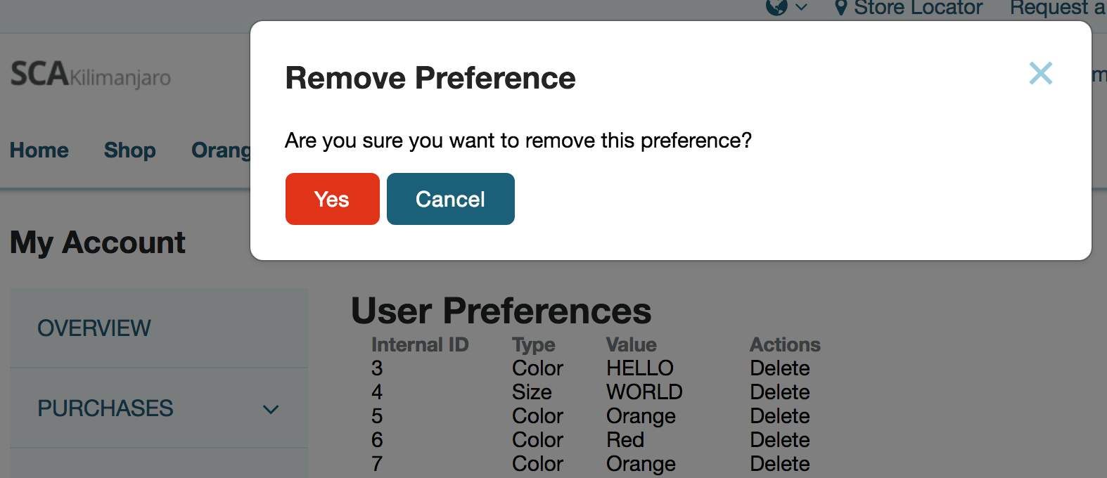
Which brings us to the main function, removeUserPreference. We start by intercepting the event (the button clicking) and preventing any default actions. Then we create a new view — our confirmation window — and pass it a bunch of options to define it. You can see that we call back to the utility function on approval.
The final part is some code to show the view in the modal. I could write a lot about how this works and what's going on, but we have a separate page that goes into a lot of detail on how to show content in a modal.
Save, Deploy and Test
And that's it! We're now ready for our final save, deploy and test.
Once it's up, visit the page and perform a delete. Do you get something like this?
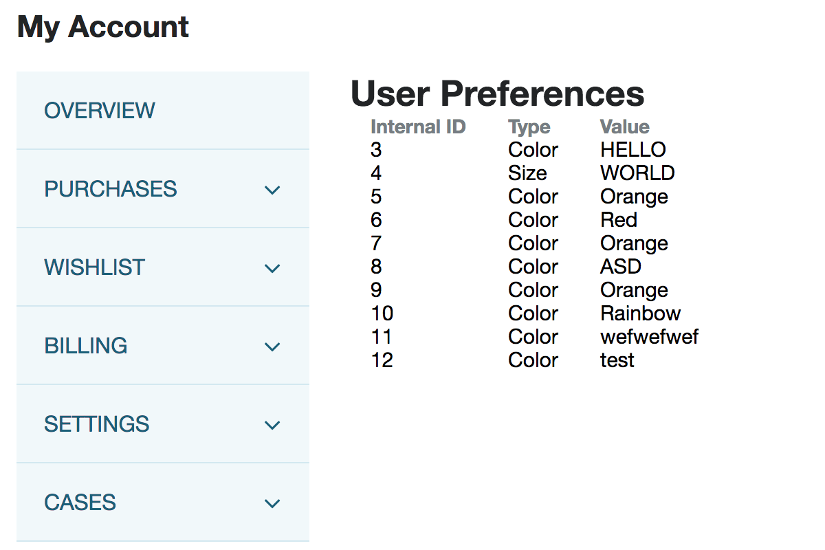
Furthermore, does the page update and remove the recently deleted record? If so, great success!
Part 4: Styling and User Experience
While what we have written so far is perfectly functional, there is still plenty left to do. In short, the experience is sub-optimal. While we added in a modal to delete records, it is still a hassle to navigate through the functionality without knowing the direct links. Furthermore, the pages themselves all look rather terrible and are in dire need of styling.
Let’s look at Sass, and some of the other cool features SCA developers can use.
Add an Edit Record Link
We added a button in the previous tutorial that enabled users to delete records, but to improve the user experience, we should add links for adding new records, and editing existing ones.
Add a Link to the Details Template
Remember, in our router set up a route so that if a user went to #preferences/:id they would be taken to a page where they can view and edit an existing user preference of the ID they provided. Thus, it's not hard to conceive of a list page which has a button next to each entry, which has this route as its href.
Open up user_preferences_details.tpl and add a new cell before the existing button:
<td><a href="/preferences/{{internalid}}">{{translate 'Edit'}}</a></td>
Next, we need to accommodate it in to our list template.
Add a colspan to the Actions Column in the List Template
The simplest thing we can do is collapse the columns for the two buttons together.
In user_preferences_list.tpl, change the Actions header cell to:
<th colspan="2">{{translate 'Actions'}}</th>
If you spin up your local server, you can hit up the list page and see something like this:
If you click the edit links, you'll be taken straight to the page for that record.
Add an Add Record Link
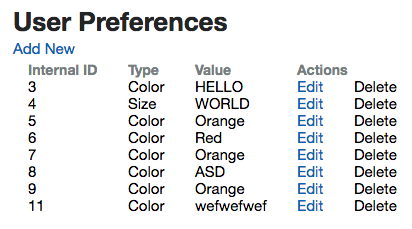
Sure, we can go to /new to trigger the new record form, but let's just add a link, quickly.
In user_preferences_list.tpl, add a link near the top:
<p><a href="/preferences/add">{{translate 'Add New'}}</a></p>
After refreshing the page, your new link will appear:
Checking if a Model is New
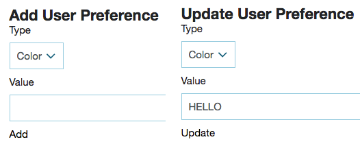
For creating and editing a record, we share a view and template. In our text, we put slashes in (ie "Add/Update") so that regardless of which one the user was doing, the text would be appropriate. However, wouldn't it be super cool if we could use the same template but show different text depending on the situation? Well, we can.
Add a Check in the Edit View
In UserPreferences.Edit.View.js, update the getContext function with a new method:
, isNew: this.model.isNew()
This will return true when we create a new model (for the purposes of adding a new record) and return false when we view an existing record.
Use the Check in the Edit Template
If you open up the list template, user_preferences_list.tpl, you can swap out the h1 tag for this:
<h1>
    {{#if isNew}}
        {{translate 'Add User Preference'}}
    {{else}}
        {{translate 'Update User Preference'}}
    {{/if}}
</h1>
You can see that we're using the if helper to perform a check to see if it's true; depending on the outcome we show different text.
Generally speaking, Handlebars is a logicless templating framework, which means that we avoid putting logic in the template files. If you look through the full list of built-in helpers you'll see that they're all rather basic. While you can add custom helpers, we generally suggest that you avoid introducing logic into them. So, where can you put the logic?
The idea is that this is performed in a JavaScript file. In our example, we could do this in the view: rather than have the text translated and determined in the template, we could perform the check in the view and then send the appropriate (and translated) string to the template. But we're not going to in our example.
Anyway, we still need to do the same thing for the submit button too.
In user_preferences_edit.tpl, replace it with:
<button type="submit">
    {{#if isNew}}
        {{translate 'Add'}}
    {{else}}
        {{translate 'Update'}}
    {{/if}}
</button>
Which results in the following, depending on the context:
Validate Data
Before sending data to NetSuite, it's a good idea to ensure that the data is 'sane', ie that it conforms to a set of minimum requirements. Common sanity checks include that it's not empty, has a minimum or maximum length, pattern matching (eg for postal codes or credit card numbers), or that a user is logged in before they can use the service.
Validation can and should be performed on the both frontend and backend, before data is transmitted to the backend. This prevents the relatively slow process of attempting to write record data, and provides instant feedback to the user about what they've done wrong.
Luckily for us, validation has been built into the SCA application, so we can add a few snippets of code and it'll do the hard work for us.
Add Validation to the Frontend Model
The first place we can start is the place where form data is added to a model (before it's sent up the chain to the server).
Open up JavaScript > UserPreferences.Model.js and add a new property:
, validation:
  {
    'type':
    {
      required: true
    , msg: 'Please select a type'
    }
  , 'value':
    {
      required: true
    , msg: 'Please enter a value'
    }
  }
Each object matches the IDs we use for the fields.
For each, we specified that they must have a value (required) and that a message is returned if they don't have values.
Mark Up the Edit Template
The JavaScript that makes this work is already built-in, and with this object of fields and rules ready, we just need to edit the template.
The template needs two things: a place for error messages to be displayed in, and for the inputs to be marked up so that they can be targeted and highlighted when there are errors with them.
Open user_preferences_edit.tpl, and add the following at the top of the form element:
<div data-type="alert-placeholder"></div>
Error messages will be sent to this div.
Now, replace the contents of the fieldset tag with the following:
<fieldset>
    <div data-input="type" data-validation="control-group">
        <label for="type">{{translate 'Type'}}</label>
        <span data-validation="control">
            <select name="type" id="type">
                {{#each typeOptions}}
                    <option value="{{internalid}}" {{#if isSelected}}selected{{/if}}>{{name}}</option>
                {{/each}}
            </select>
        </span>
    </div>

    <div data-input="value" data-validation="control-group">
        <label for="value">{{translate 'Value'}}</label>
        <span data-validation="control">
            <input type="text" name="value" id="value" value="{{value}}">
        </span>
    </div>
</fieldset>
You can see that we've split the inputs up into groups. Each group is marked up with a data-input attribute, which we use to associate the specific validation rules with the specific inputs, as well as data-validation="control-group", which help us target the correct part of the form when a rule is broken. There is also similar markup on span elements surrounding the inputs.
Refresh the page for your local server and then go to add a new user preference. Try to submit the form without entering a value, you should see it fail:
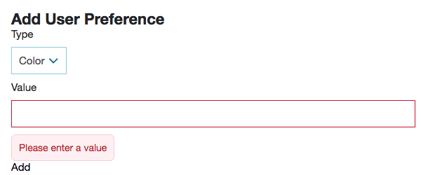
Importantly, if you check the Network tab of your developer tools, you'll see that no call to the service is made when there are validation failures: the user is alerted immediately and the server's time is not wasted by handling improper data.
Add Validation to the Backend Model
We also add validation to the backend model. Why? Frontend JavaScript can be overridden or disabled; SuiteScript files hosted on NetSuite servers cannot. This is a 'belts and braces' type approach, where we make absolutely sure that our pants won't fall down.
Open SuiteScript > UserPreferences.Model.js and add a new property:
, validation:
  {
    'type':
    {
      required: true
    , msg: 'Please select a type'
    }
  , 'value':
    {
      required: true
    , msg: 'Please enter a value'
    }
  }
It's the same as the one used in the frontend model — that's because the same code runs on both the front and back ends.
Then, within the create and update functions, add this code to the top of each:
this.validate(data);
This ensures that the validation is applied to the data before we attempt to save it to the server.
To test this, you will need to comment out the validation object we put in the frontend model — if our data is invalid, then the frontend JavaScript will always catch it first.
When you've done that, run a full deploy up to the servers. After it's completed, hit up the Add and Update pages and see what happens when you try to submit an empty field.
If you want to learn more about the rules available, you can look at the defaultValidators variable in third_parties > backbone.validation > backbone-validation.js or take a look at the author's documentation. For use cases, just take a look at some of the models built into existing SCA modules.
Don't forget to uncomment the validation rules in the frontend model.
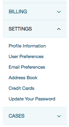
Add a Menu Item
At the moment, users can only get to the preferences page if they already know the URL, but that's not very good UX is it? Let's add a link in the account navigation menu.
Open up UserPreferences.js and add a new method:
, MenuItems:
  {
    parent: 'settings'
  , id: 'userpreferenceslist'
  , name: 'User Preferences'
  , url: 'preferences'
  , index: 1
  }
This configuration object specifies the following things:
- parent: the ID for the menu item that the link will live under
- id: a HTML ID that will added to the link when it is generated
- name: the text shown for the link
- url: the URL (route) that will be used for the link
- index: the position in the list that it will appear (counting starts from 0)
When you visit the account section on your local server, expand the Settings menu and you will see your link there. Clicking it will take you through to the landing page!
Auto-Expand the Navigation
A neat little user experience improvement we can make to the interface is automatically expanding the place in the menu that we just added.
In UserPreferences.List.View.js and UserPreferences.Edit.View.js, add:
, getSelectedMenu: function ()
  {
    return 'userpreferenceslist'
  }
Note that we're returning the ID we assigned in the MenuItems object we added to the entry point file.
Add Breadcrumbs
When you go up deep within a section, you frequently see breadcrumbs at the top of the section, showing how far you are in a hierarchy. This helps ground the user, so they know exactly where they are, but also provides ways out, should they need to head back.
Open UserPreferences.List.View.js and add a new method:
, getBreadcrumbPages: function ()
  {
    return [{text: 'User Preferences'}]
  }
Now head to UserPreferences.Edit.View.js and add a similar method:
, getBreadcrumbPages: function ()
  {
    if (this.model.isNew())
    {
      return [
        {text: 'User Preferences', href: '/preferences'}
      , {text: 'New'}
      ]
    }
    else
    {
      return [
        {text: 'User Preferences', href: '/preferences'}
      , {text: 'Edit'}
      ]
    }
  }
Hopefully, the text and href options are self-explanatory. However, you should note that when we provide an array of objects, it interprets the first as the parent and each one a child to the last.
You should also know that the last object passed will never generate a clickable link (the idea being that if a user is already on the page, then they don't need a link to it in the breadcrumbs).
If you refresh your page, you should see one of these:
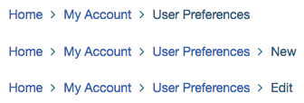
Prepare for Sass
So far, we have completely ignored the CSS/styling of this module, and now is the time to change that.
SuiteCommerce Advanced uses Sass for its stylesheets. Sass is a scripting language that allows us to write more complex CSS by writing what we want in the language and then have it compile into native CSS. This is all done during the deploy process.
It gives us new syntax, such as variables, mixins and nested rules, thus giving us power tools to make our jobs easier.
There's a lot of nuance and depth to it, which I'm going to skirt over in this tutorial, but you should take a look at their documentation as well past blog posts about Sass, such as the ones in our best practices.
Anyway, to prepare for the code, we need to do the following:
- Create a Sass directory in the module root
- Update the module's ns.package.json file so that it's included with the module code:
, "sass": ["Sass/*.scss"] - Update distro.json so
"UserPreferences"is included in the dependencies array formyaccount.css
Finally, before we begin, let's go over some important rules (conventions) that we employ:
- Generally speaking, Sass and template files have a 1:1 relationship: keep things modular
- Most Sass files start with an underscore — this means that they're 'partials' and are going to be included into other, larger Sass files (and aren't going to be rendered by themselves)
- Classes in template files are semantic and start with the template name
- Use existing variables and 'helper' classes that we built into the base SCA Sass (see the files in Modules > BaseSassStyles > Sass
Style the List Template
In the Sass directory, create _user_preferences_list.scss and then add:
.user-preferences-list-header {
    @extend .list-header;
    position: relative;
    margin-bottom: $sc-padding-lv3;
    display: inline-block;
    width: 100%;
}

.user-preferences-list-title {
    @extend .list-header-title;
    float: none;
}

.user-preferences-list-table-header-actions {
    width: 25%;
}

.user-preferences-list-button-new {
    @extend .list-header-button;
    margin-top: $sc-padding-lv4;
    position: absolute;
    top: 25;
    z-index: 1;
    right: 0;

    @media (min-width: $screen-sm-min) {
        margin-top: 0;
        z-index: 0;
        top: 0;
        margin-bottom: $sc-padding-lv3;
    }
}

.user-preferences-list-table {
    @extend .recordviews-table;
}

.user-preferences-list-table-header {
    @extend .recordviews-row-header;
    border-top: 1px solid $sc-neutral-shade-300;
}
There's a fair bit of CSS in here, but before we look at it, let's add the classes that they're applying styling to.
Open user_preferences_list.tpl and replace it with:
<section class="user-preferences-list">
    <header class="user-preferences-list-header">
        <h1 class="user-preferences-list-title">{{translate 'User Preferences'}}</h1>
        <a class="user-preferences-list-button-new" href="/preferences/add">{{translate 'Add New'}}</a>
    </header>
    <table class="user-preferences-list-table">
        <thead class="user-preferences-list-table-header">
          <tr>
              <th class="user-preferences-list-table-header-id">{{translate 'Internal ID'}}</th>
              <th class="user-preferences-list-table-header-type">{{translate 'Type'}}</th>
              <th class="user-preferences-list-table-header-value">{{translate 'Value'}}</th>
              <th class="user-preferences-list-table-header-actions" colspan="2">{{translate 'Actions'}}</th>
          </tr>
        </thead>
        <tbody data-view="UserPreferences.Collection"></tbody>
    </table>
</section>
OK, on the face of it, it looks like pretty standard CSS except there's some cool stuff going on.
Firstly, the extend keyword lets us take a previously defined class and use it in our new class — we can then add in additional declarations. In a way, this is like what we're doing with our JavaScript: we have base classes that form the foundations of what we want to do, and then we can build our own customizations on top. if we tried to do this with regular CSS, we would end up repeating ourselves a lot, or all our elements would have multiple classes on them.
Secondly, you can see that in one case, we are nesting a media query with a declaration. What this lets us do is easily create a duplicate declaration, but one that that will only apply when the screen is of a particular width.
Finally, you'll see a whole host of existing variables and classes being used or extended throughout. You can refer to the style guide for what these do, but it may be better to look at the source code.
As mentioned previously, a lot of variables as well as atoms and molecules (ie the building blocks of our styles) are declared within the BaseSassStyles module. However, some bigger bits are declared elsewhere. For example, the list-header classes we're using appear in the ListHeader module. Sometimes you'll need to perform a search on your source code to find where its declared (which will also net some results showing where it's already being used).
If you're using a Mac or other Unix system like I am, then grep can be used; for example:
$ grep -rl "list-header-title" Modules
Modules/suitecommerce/ListHeader@2.3.2/Sass/_list-header-view.scss
Modules/suitecommerce/Facets@3.2.0/Sass/_facets-facet-browse.scss
Modules/suitecommerce/ProductList@3.0.3/Templates/product_list_details_later.tpl
Modules/suitecommerce/ProductList@3.0.3/Sass/_product-list-details-later.scss
Modules/suitecommerce/BaseSassStyles@3.0.0/Sass/molecules/_list-header.scss
Modules/suitecommerce/Case@2.3.1/Sass/_case-list.scss
Modules/extensions/UserPreferences@1.0.0/Sass/_user_preferences_list.scss
Style the Details Template
Before we take a look at how this looks, we should style the template that is used to generate the rows in the table.
Replace the contents of user_preferences_details.tpl with:
<tr class="user-preferences-details-table-row">
    <td class="user-preferences-details-id">
        <span class="user-preferences-details-label">{{translate 'Internal ID'}}: </span>{{internalid}}
    </td>
    <td class="user-preferences-details-type">
        <span class="user-preferences-details-label">{{translate 'Type'}}: </span>{{type}}
    </td>
    <td class="user-preferences-details-value">
        <span class="user-preferences-details-label">{{translate 'Value'}}: </span>{{value}}
    </td>
    <td><a class="user-preferences-details-edit" href="/preferences/{{internalid}}">{{translate 'Edit'}}</a></td>
    <td><button class="user-preferences-details-delete" data-action="delete" data-id="{{internalid}}">{{translate 'Delete'}}</button></td>
</tr>
So, we're following the same pattern of semantic class names.
One new thing, however, is that we've added labels before the values we're pulling from the context object. Why would we do that if we're building a table? Well, the plan is to hide them when there's enough space to fully render the table; otherwise, we're going to show them when the screensize shrinks and we change the layout of the table.
To wit, in the Sass folder, create _user_preferences_details.scss and in put:
.user-preferences-details-hide-label {
    @media (min-width: $screen-md-min) {
        display: none;
    }
}

.user-preferences-details-table-row {
    @extend .recordviews-row;
}

.user-preferences-details-table-row:hover {
    @extend .recordviews-row:hover;
}

.user-preferences-details-label {
    @media (min-width: $screen-md-min) {
        display: none;
    }
}

.user-preferences-details-edit {
    @extend .button-small;
    @extend .button-tertiary;
    @media (max-width: $screen-md-min) {
        margin-bottom: $sc-margin-lv1;
    }
}

.user-preferences-details-delete {
    @extend .button-small;
    @extend .button-primary;
    background-color: $sc-color-error;
    border-color: darken($sc-color-error,20);
    @media (max-width: $screen-md-min) {
        margin-bottom: $sc-padding-lv1;
    }
}

.user-preferences-details-delete:hover {
    background-color: saturate(lighten($sc-color-error, 4), 4);
}
You can see that there isn't anything particularly novel here, until we get to the bottom. I've dropped in two functions called saturate and lighten for use within our CSS.
Imagine this scenario: you've taken the steps to declare color variables that can be used throughout your stylesheets — so that you only have to declare the colors once (making it easier to update them in future) — but now you want to use a variation of that color, one more vivid and lighter than that color. What do you do?
You could manually calculate what color you need and set that as a variable, or you can use functions to calculate for you on the fly. Again, what this means that you can declare once and move on — and if you change your mind about the base color, the functions will simply perform transformations on the new color.
For a full list of functions, check out their documentation.
Stop and restart your local server. When you visit the list page, you should see something like this:
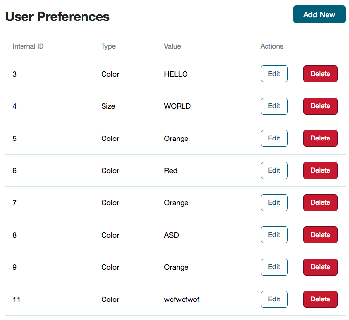
Try resizing the window and seeing how the appearance changes at different widths.
Style the Edit Template
The final bit of styling we need to do relates to the form that users complete to add or edit user preferences records. You should be familiar with what we're doing by now.
Replace the contents of user_preferences_edit.tpl with:
<section class="user-preferences-edit">
    <header class="user-preferences-edit-header">
        <h1>
            {{#if isNew}}
                {{translate 'Add User Preference'}}
            {{else}}
                {{translate 'Update User Preference'}}
            {{/if}}
        </h1>
    </header>
    <form>
        <div data-type="alert-placeholder"></div>
        <fieldset>
            <small>Required <span class="user-preferences-edit-required">*</span></small>
            <div class="user-preferences-edit-control-group" data-input="type" data-validation="control-group">
                <label class="user-preferences-edit-label" for="type">
                    {{translate 'Type'}}
                    <small><span class="user-preferences-edit-required">*</span></small>
                </label>
                <span data-validation="control">
                    <select class="user-preferences-edit-select" name="type" id="type">
                        {{#each typeOptions}}
                            <option value="{{internalid}}" {{#if isSelected}}selected{{/if}}>{{name}}</option>
                        {{/each}}
                    </select>
                </span>
            </div>

            <div class="user-preferences-edit-control-group" data-input="value" data-validation="control-group">
                <label class="user-preferences-edit-label" for="value">
                    {{translate 'Value'}}
                    <small><span class="user-preferences-edit-required">*</span></small>
                </label>
                <span data-validation="control">
                    <input class="user-preferences-edit-input" type="text" name="value" id="value" value="{{value}}">
                </span>
            </div>
        </fieldset>
        <div class="user-preferences-edit-control-group">
            <button class="user-preferences-edit-submit" type="submit">
                {{#if isNew}}
                    {{translate 'Add'}}
                {{else}}
                    {{translate 'Update'}}
                {{/if}}
            </button>
        </div>
    </form>
</section>
Next, create Sass > _user_preferences_edit.scss with:
.user-preferences-edit {
    @extend .box-column-bordered;
}

.user-preferences-edit-header {
    margin-bottom: $sc-margin-lv3;
}

.user-preferences-edit-control-group {
    @extend .control-group;
    margin: $sc-margin-lv4 0 0 0;
}

.user-preferences-edit-input {
    @extend .input-large;
}

.user-preferences-edit-label-required {
    @extend .required;
}

.user-preferences-edit-submit {
    @extend .button-primary;
    @extend .button-medium;
}
This is basic styling, but like before you can see that we're relying on existing styles.
Stop and restart your local server (we added new files which it needs to track) and then visit a page to add or edit a user preference. It should look like this:
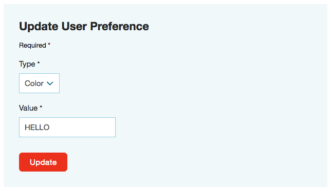
Code samples are licensed under the Universal Permissive License (UPL), and may rely on Third-Party Licenses